Radio Flyer's 100th Anniversary "Kid's Travel Agency" Posters.
Radio Flyer is hosting the first ever kids travel agency to celebrate 100 years of inspiring imaginative play and unforgettable adventures. At Radio Flyer Adventure Travel, children are introduced to impossibly wonderful destinations they can visit only with their imagination and a Radio Flyer. https://www.radioflyer.com/travel-agency/
"See Octopus Shiny Treasure Bay" © Bill Mayer 2017
A new poster for Radio Flyer. FCB had a great idea to inspire kids to use thier imaginations through a series of travel posters to fantastic places that only could exist in dreams. the instructions and specs for the poster came in with a huge packet of materials and spec. More than I ever remember getting in the past on any project... But once I had gotten through going over all of that. It just started off in the normal way all jobs do, with a little research looking at old travel posters to get a feel for the atmosphere and feelling of a vintage poster to a fantasy destination. I am always drawn to bold, simple images so I explored in the thumbnails various compositions tackling the manditory elements. I wanted the octopus to be huge, larger than life. Looming and imposing, but not scary. I decided to make the wagon into a ship.
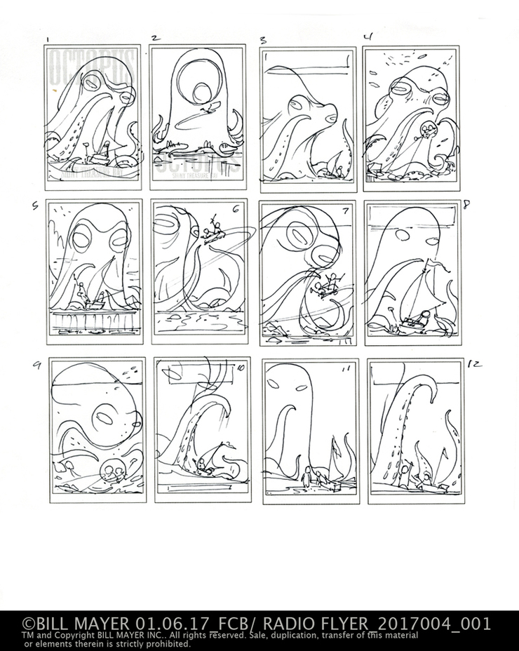
I tried two directions: one, the octopus as the island towering in the distance; the ship and kids in the forground. The other using the wagon as a bathysphere, exploring an underwater world in search of treasure. I'm not sure they really got the underwater thing from my thumbnails, but Kevin picked a couple very similar directions and i started refining the sketch.
thumbnail for Octopus Shiny Treasure Bay. They picked #1 and #8 both very similar directions.
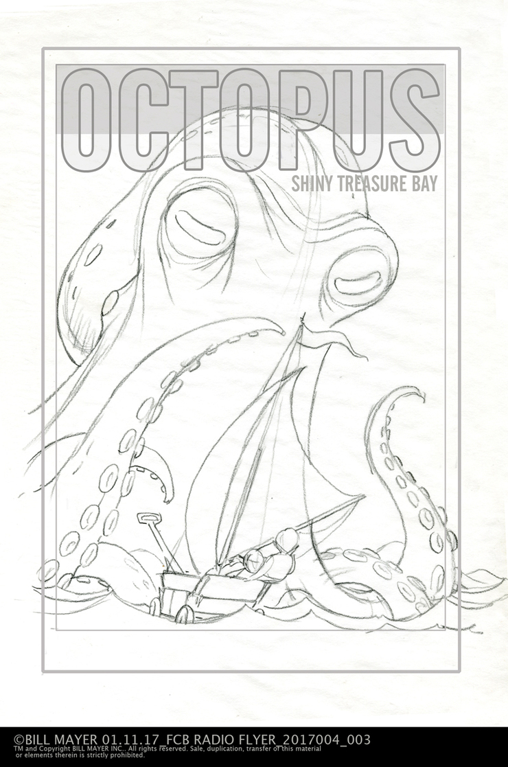
Slightly tighter thumbnails working out prportions on size of the boat and octopus.
In process art for the octopus almost finished....
I know, airbrush, it's just so much faster for me... Some textures and highlights I will add in Photoshop later....
I wanted to add some cloudy atmosphere to separate the background, make it lighter against the silhouetted kids and boat. I decided to do the kids and boat separate from the octopus to give me the option of adjusting the size and placement. I added distant mountains, birds, and treasure to reinforce the size of the octopus without reducing the size of the kids and wagon. Ultimately I decided to have the ship coming out of the shadow slightly to allow some details to show.
When I first pulled everything into the poster I loved how the wagon and kids looked just floating in the sky.... After I had put the final poster together I roughly pulled together a variation to show the Art director. Ultimately they decided to stay with the original design.
I was really happy with where this poster ended up. I was great fun working with Kevin Grady and the creative team at FCB. They gave me a ton of freedom and that always pays off in the final result. Cant wait to see the final 24x36 printed posters... So much fun. I need a few more of these to work on.


