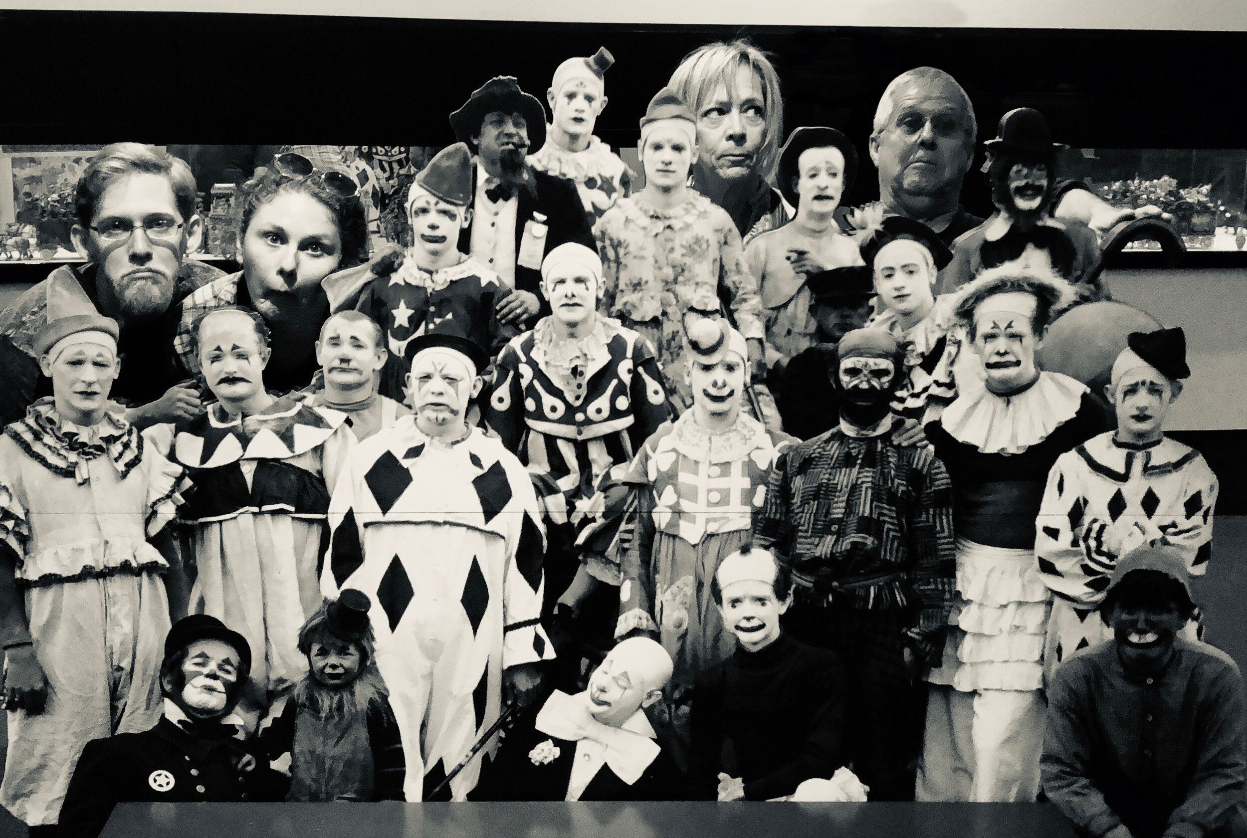
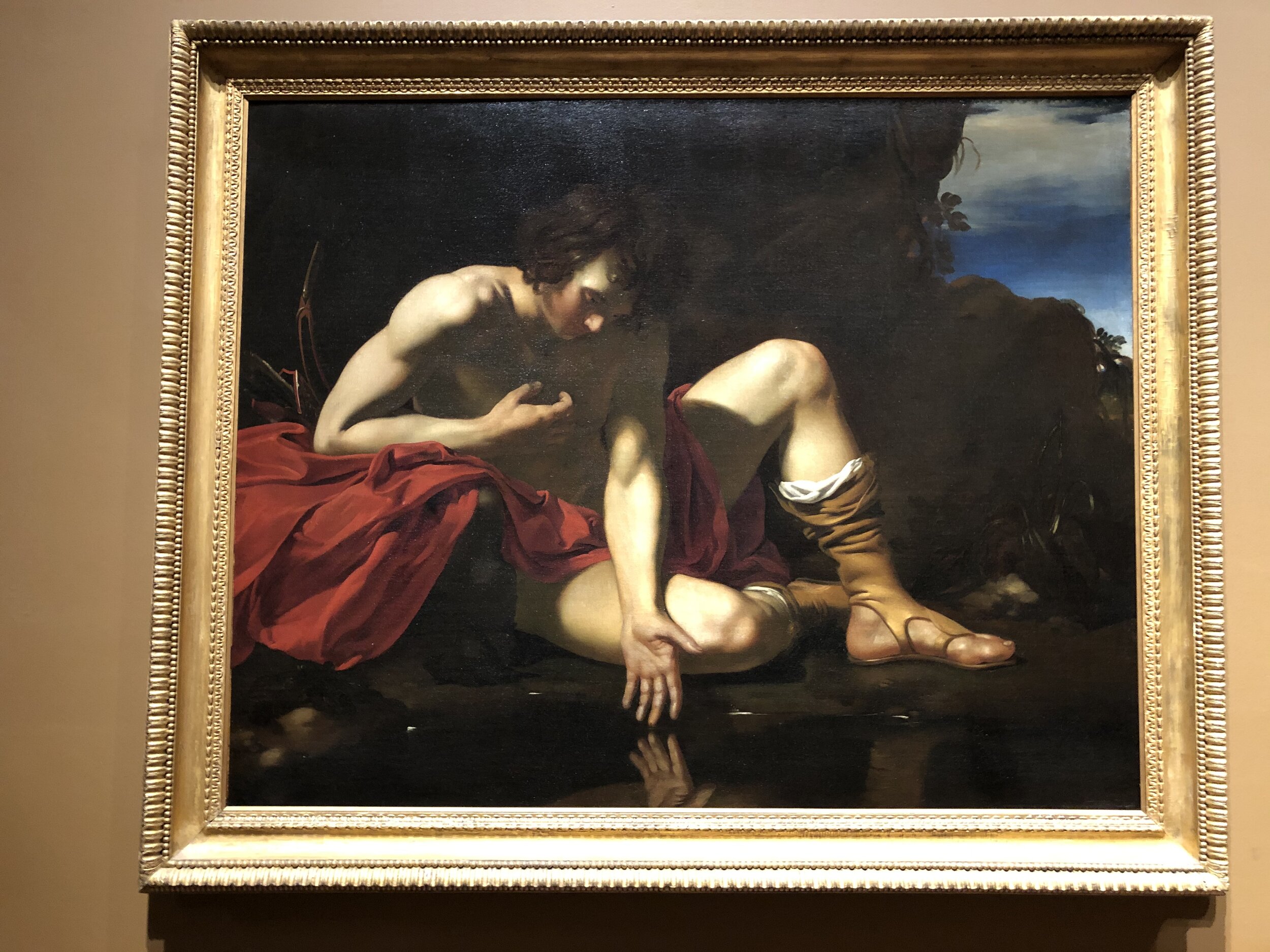
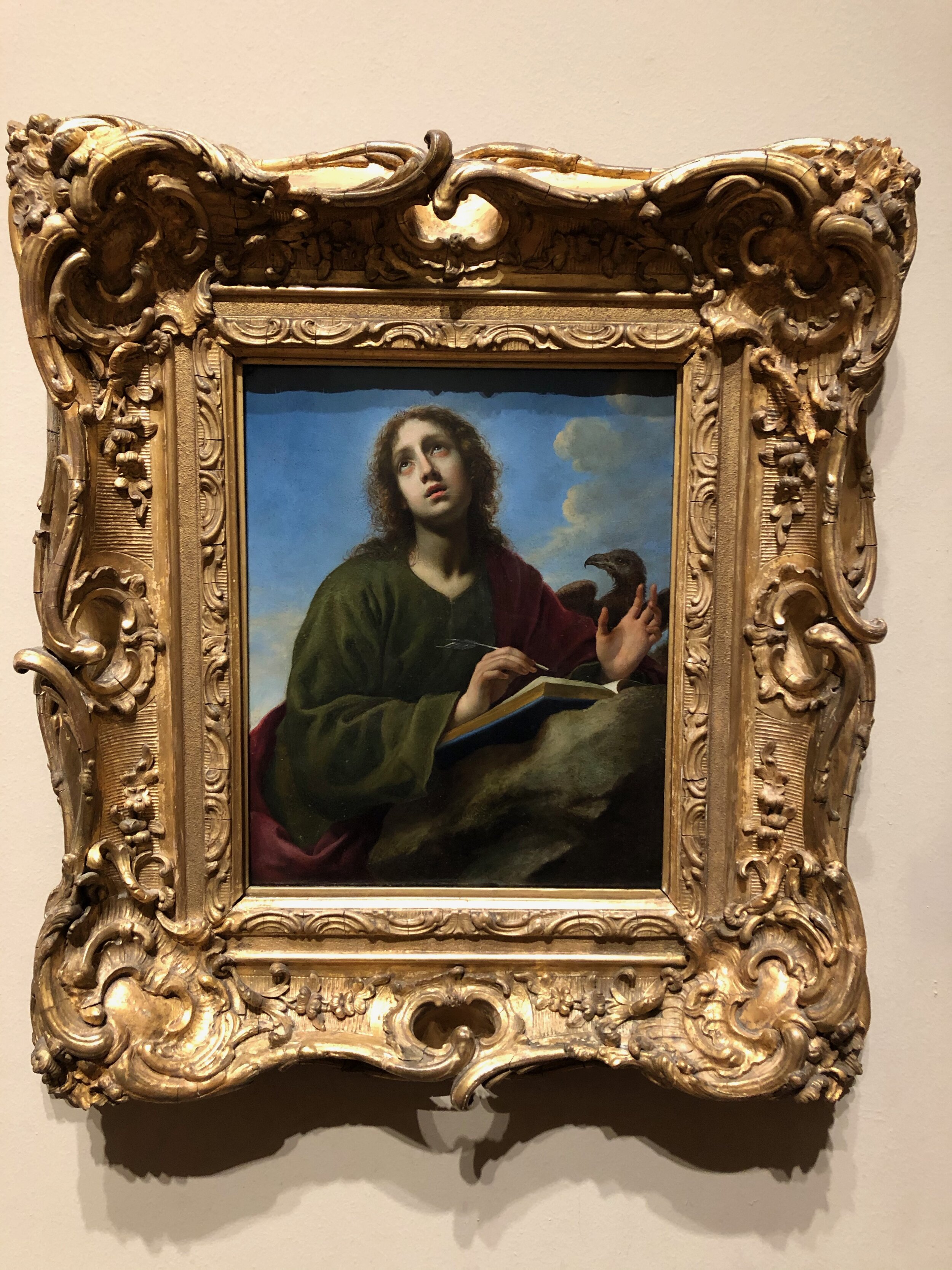
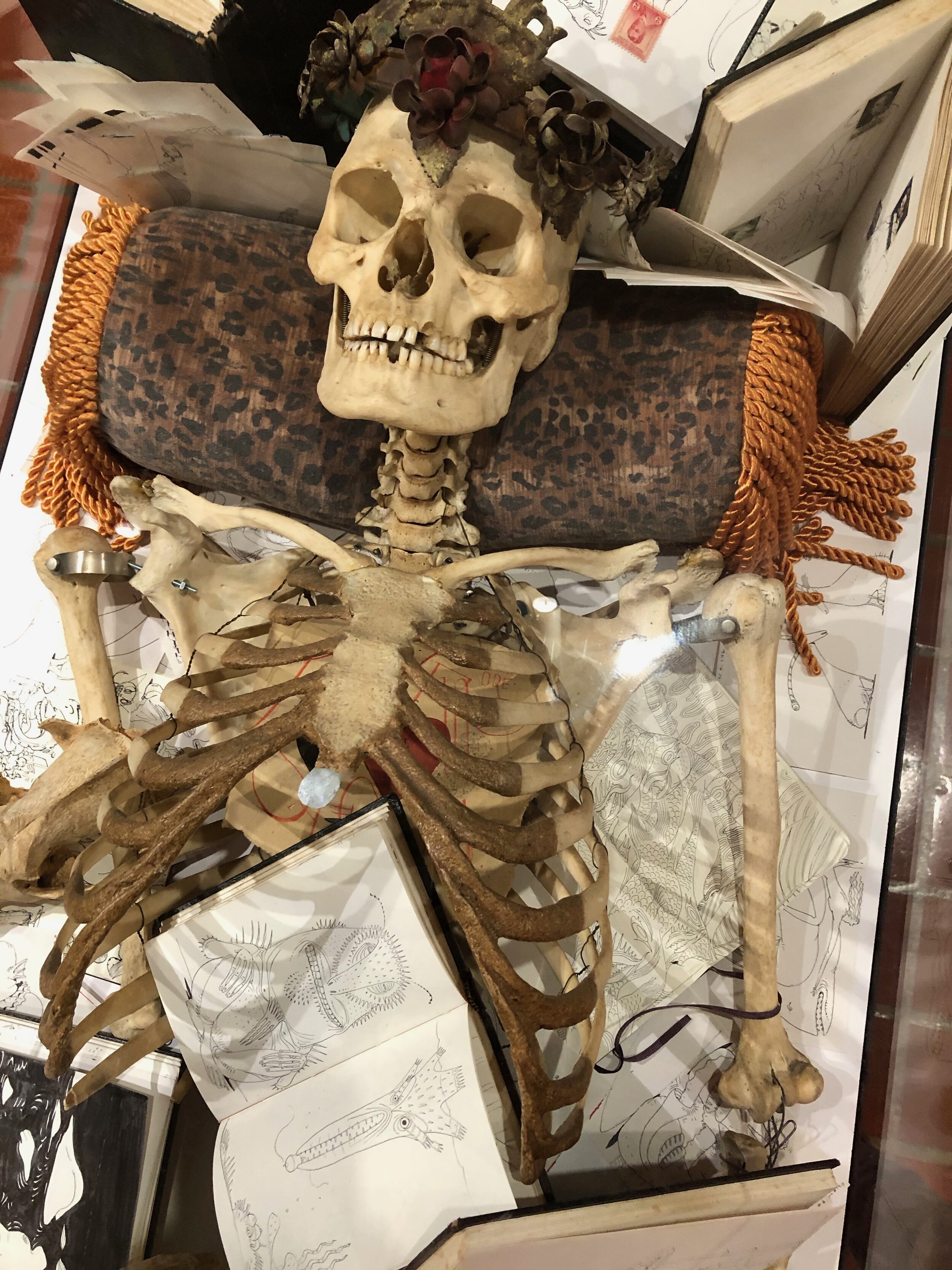
Otherworldly and Wild

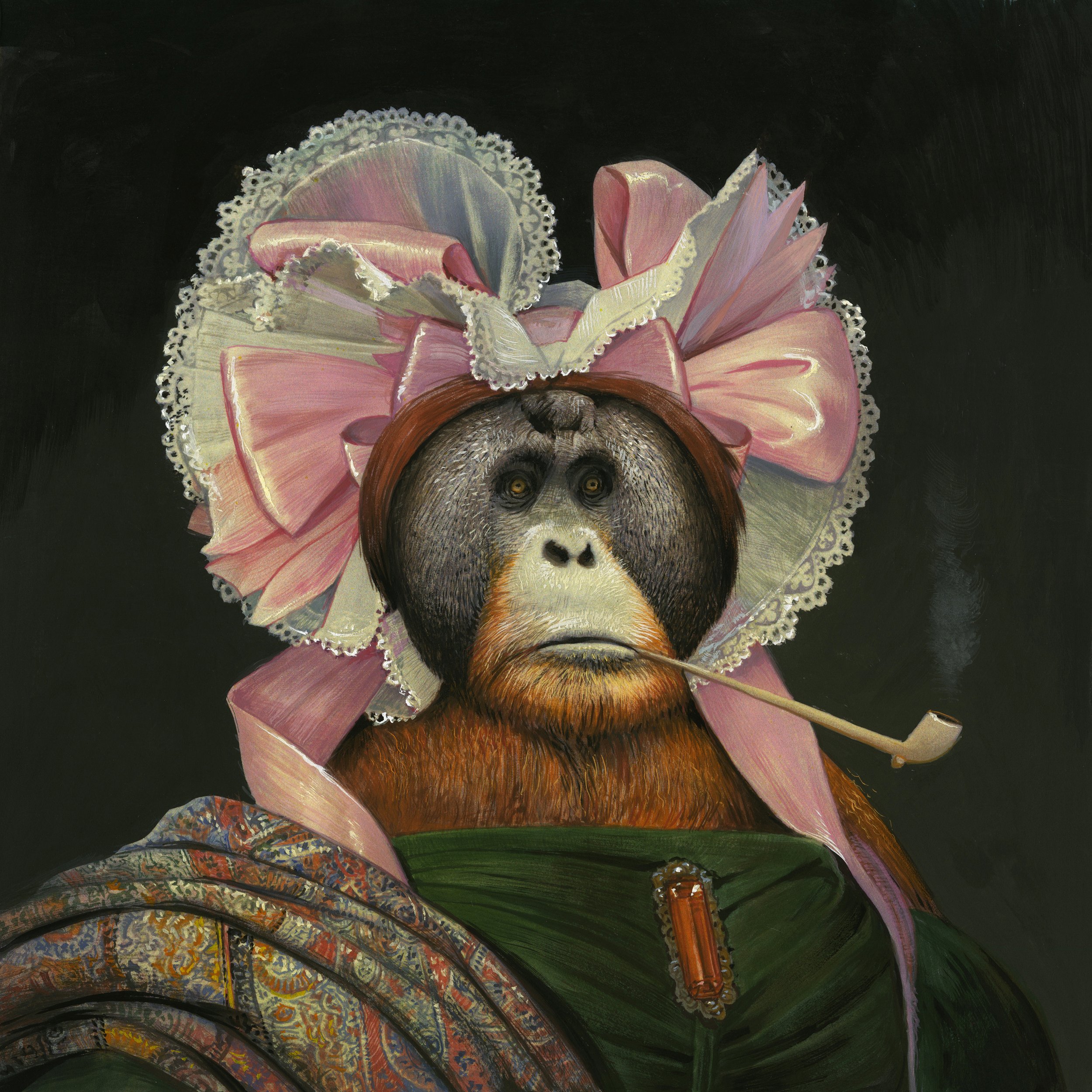
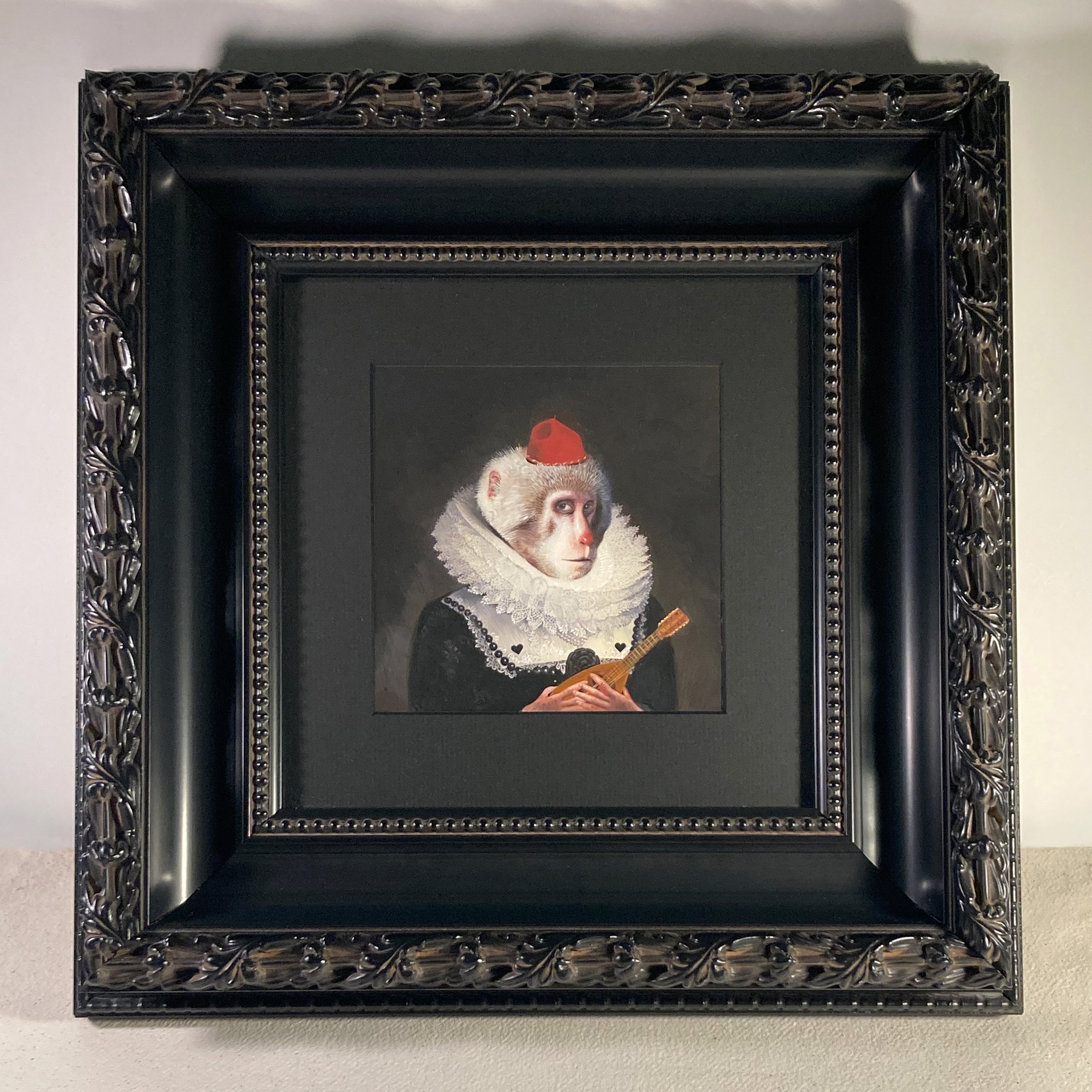
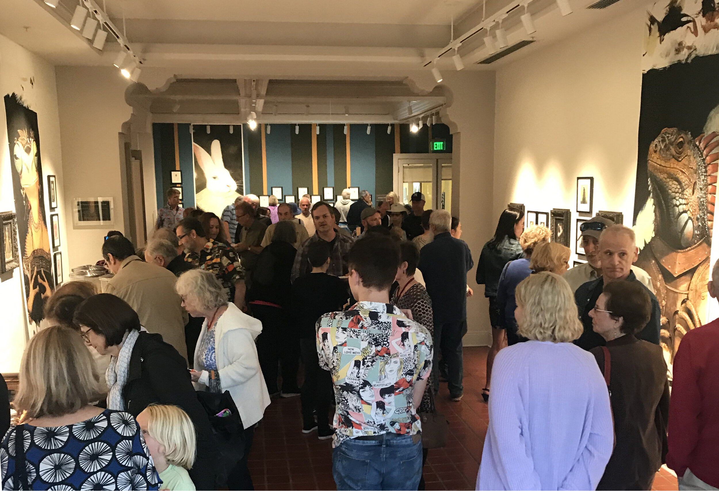
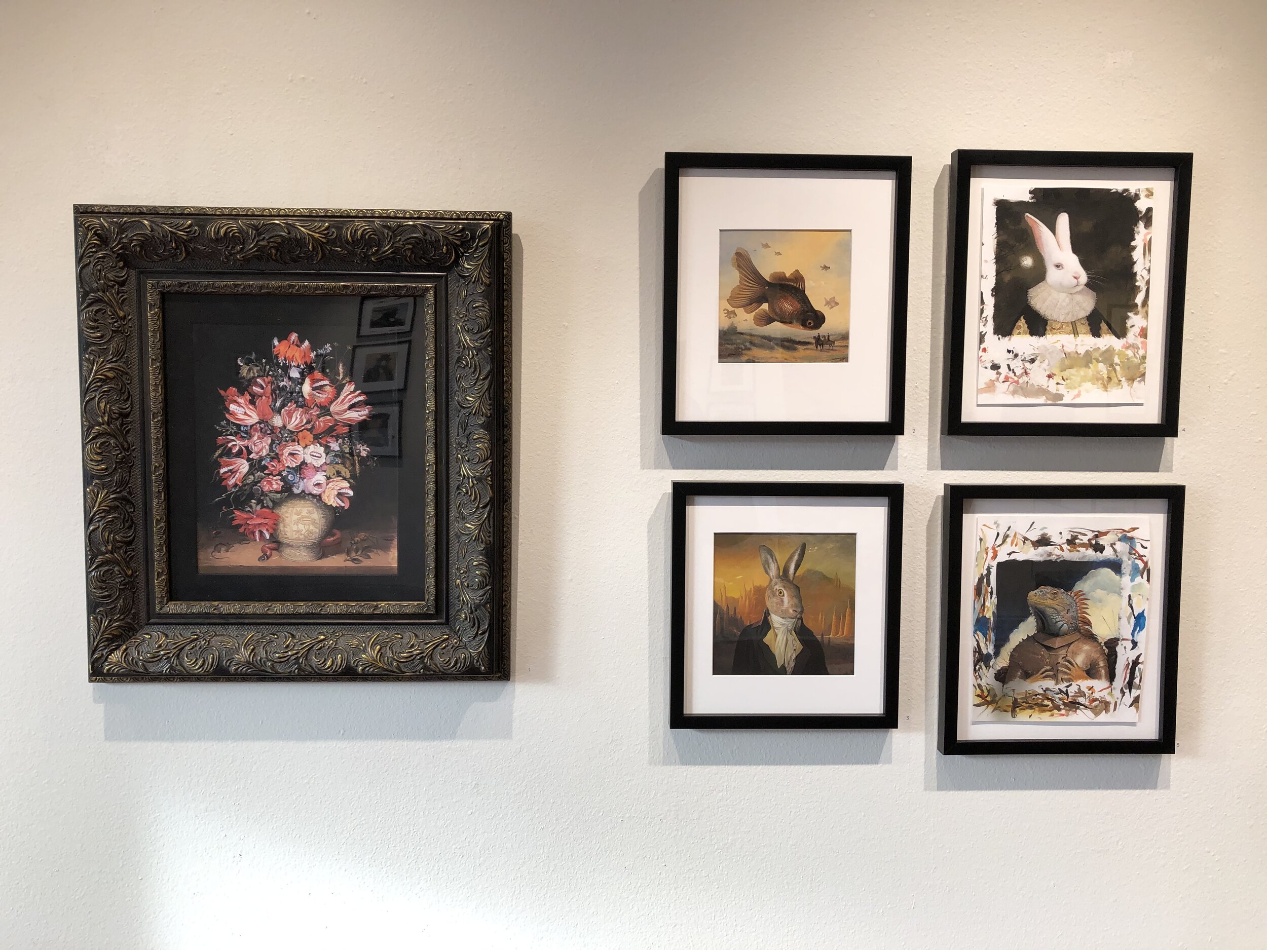
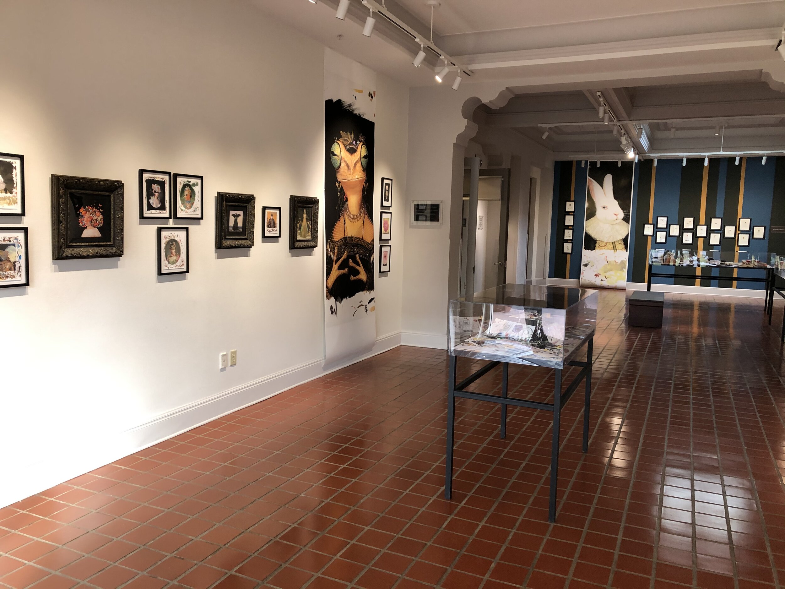
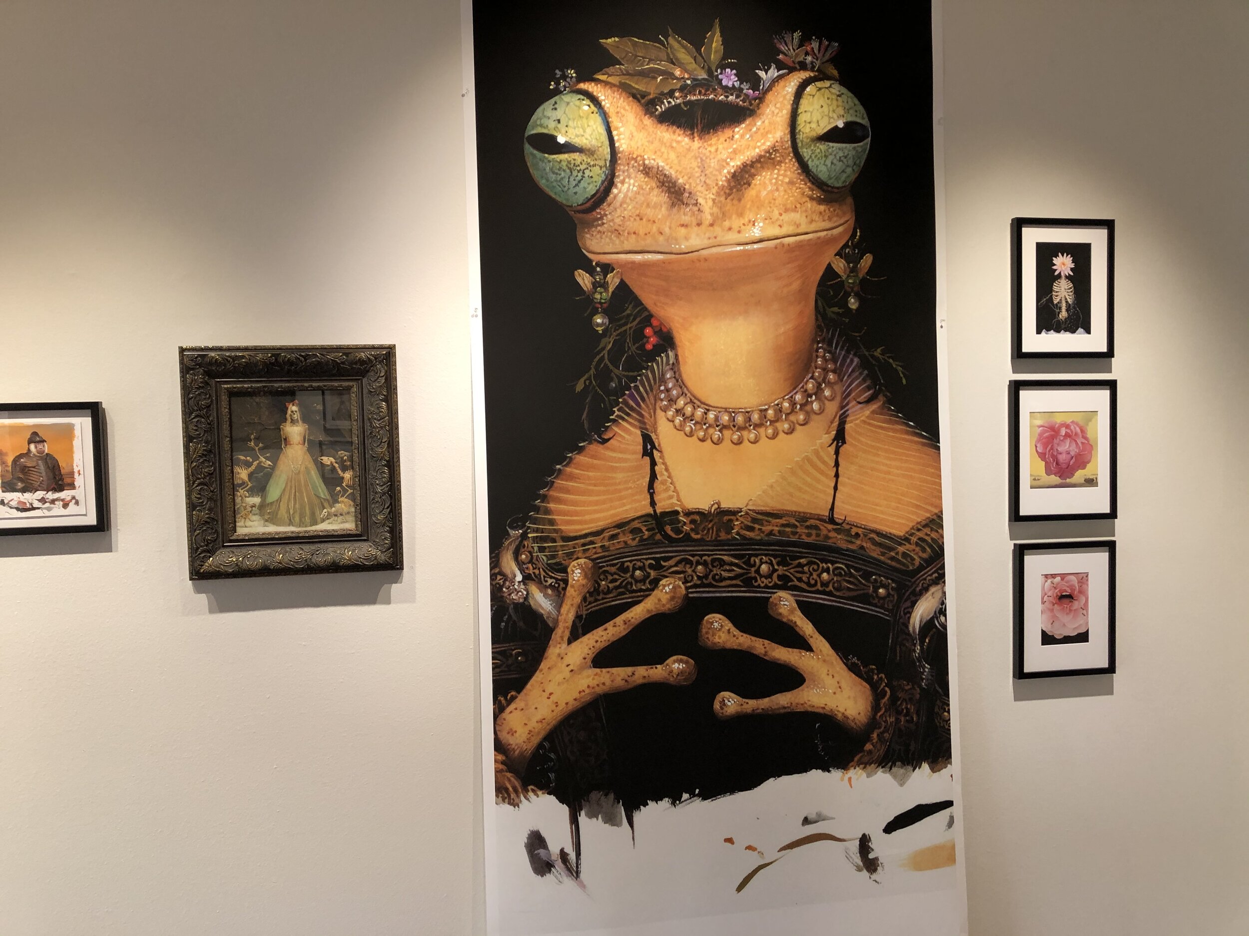
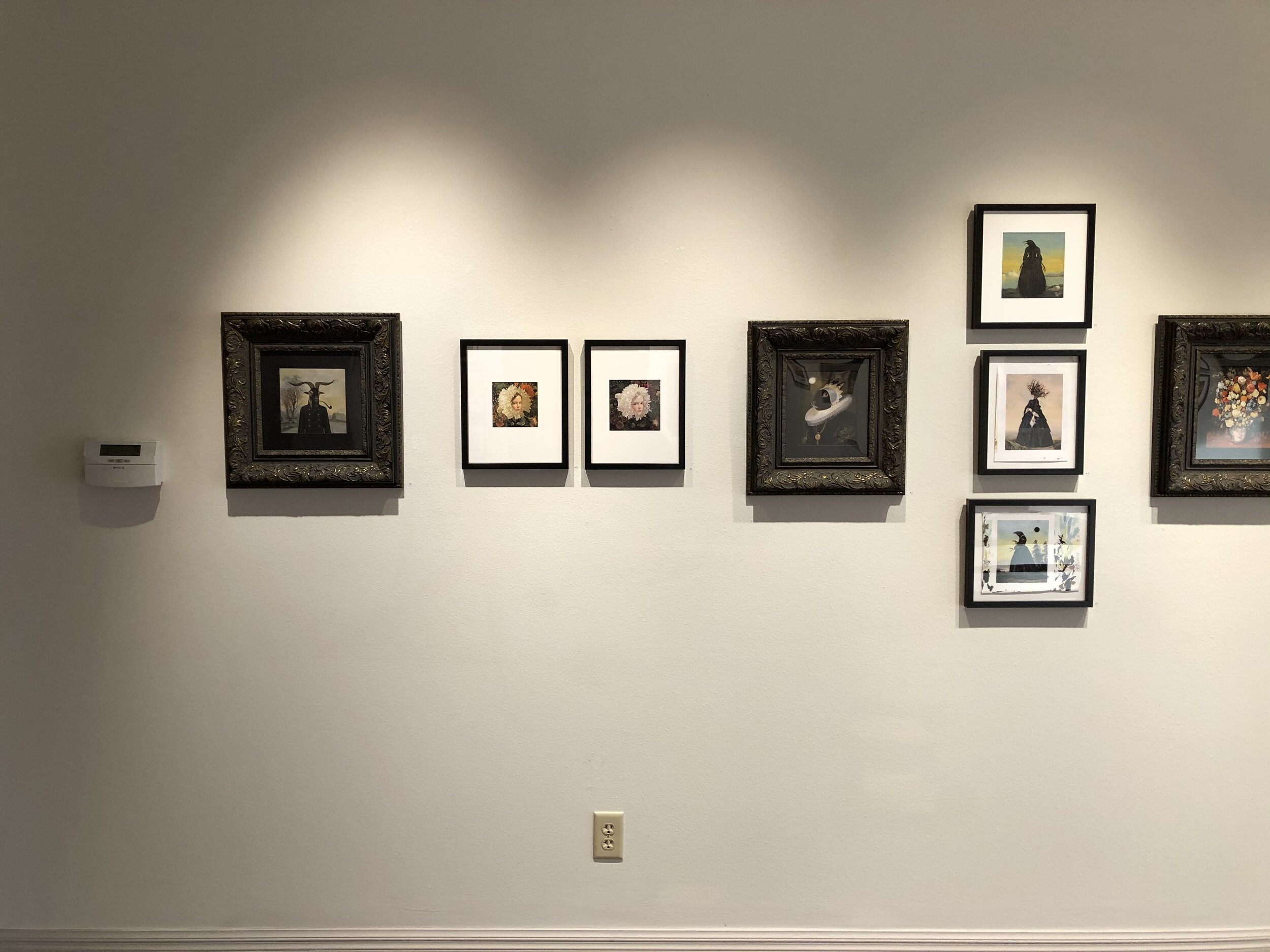
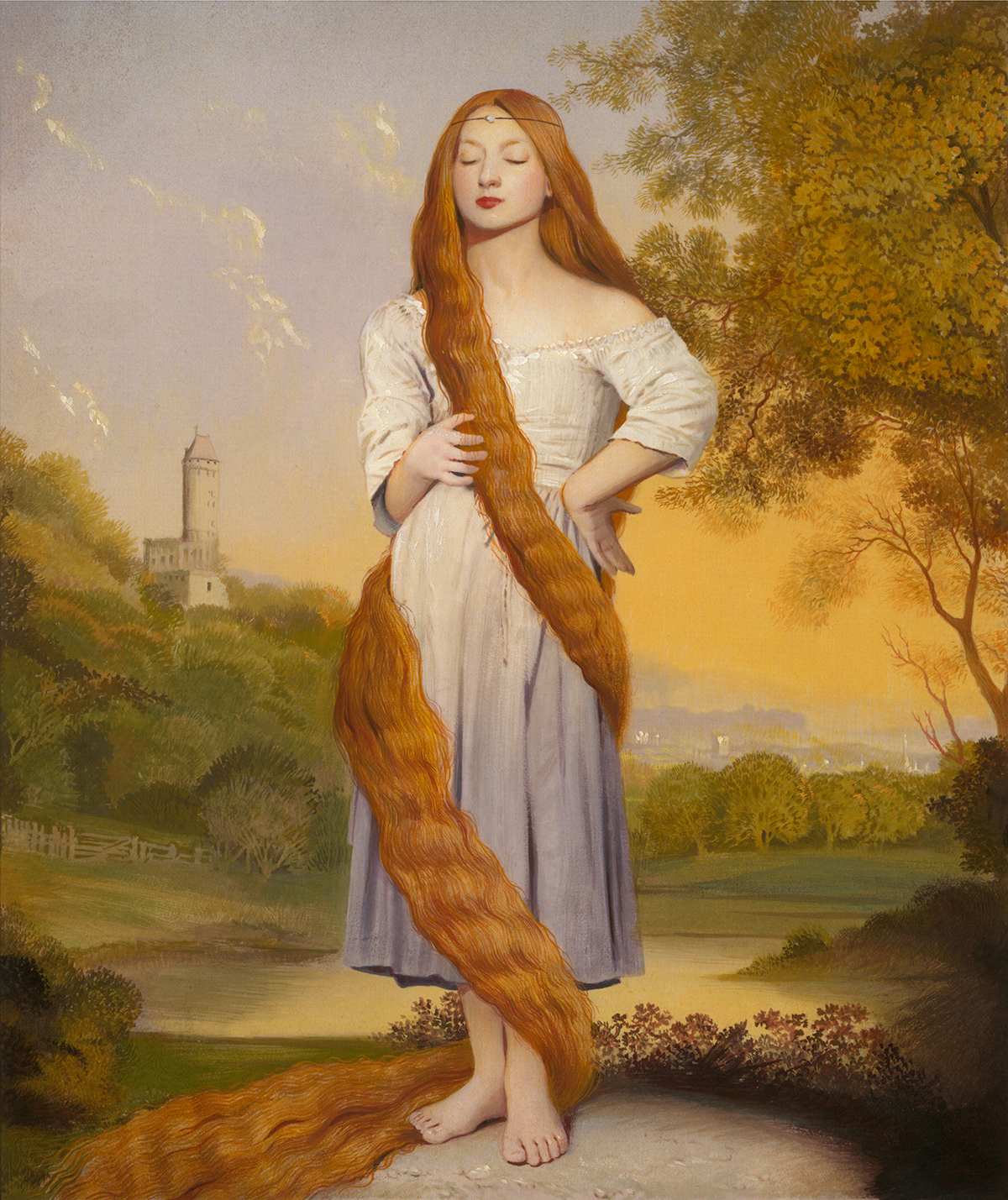
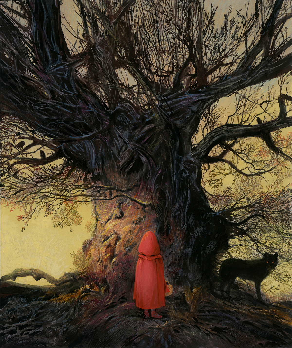
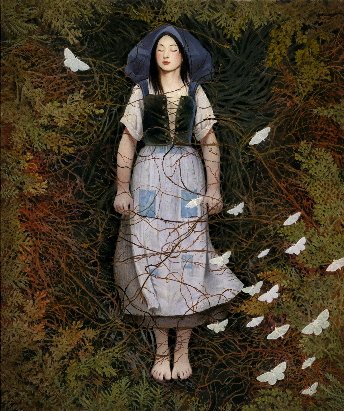
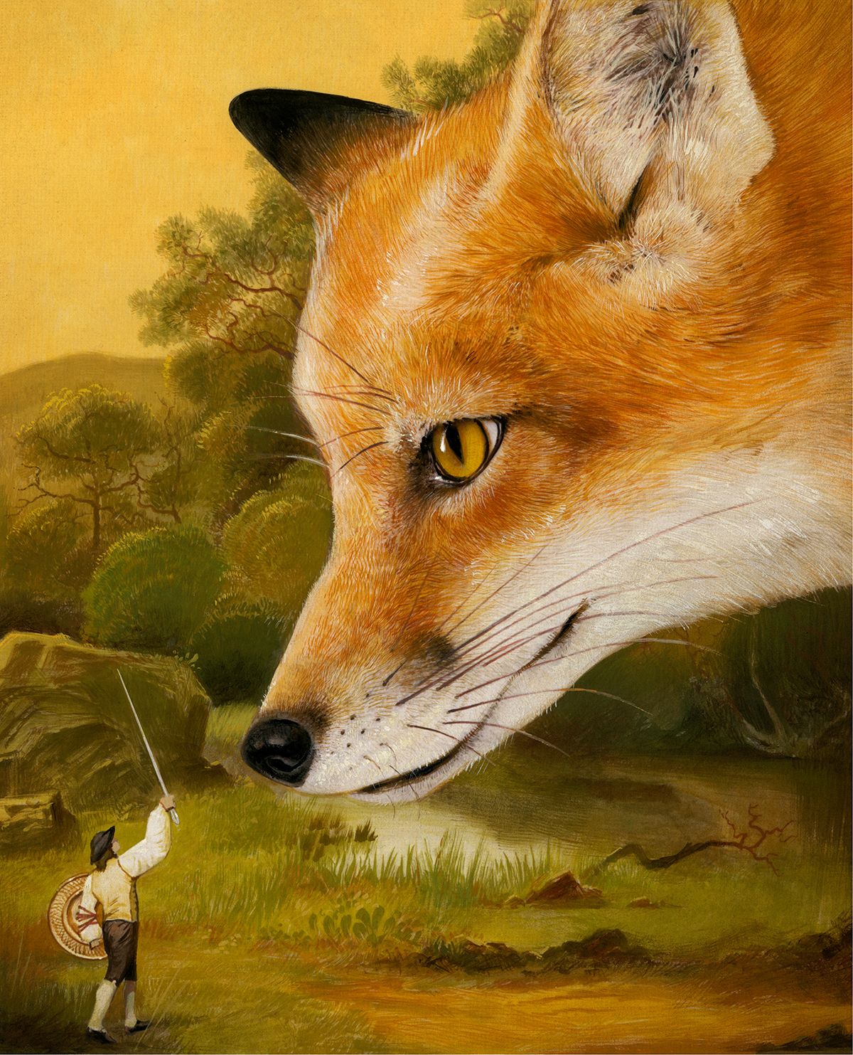
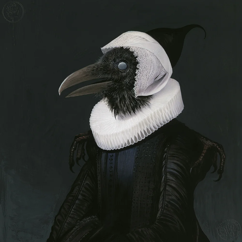
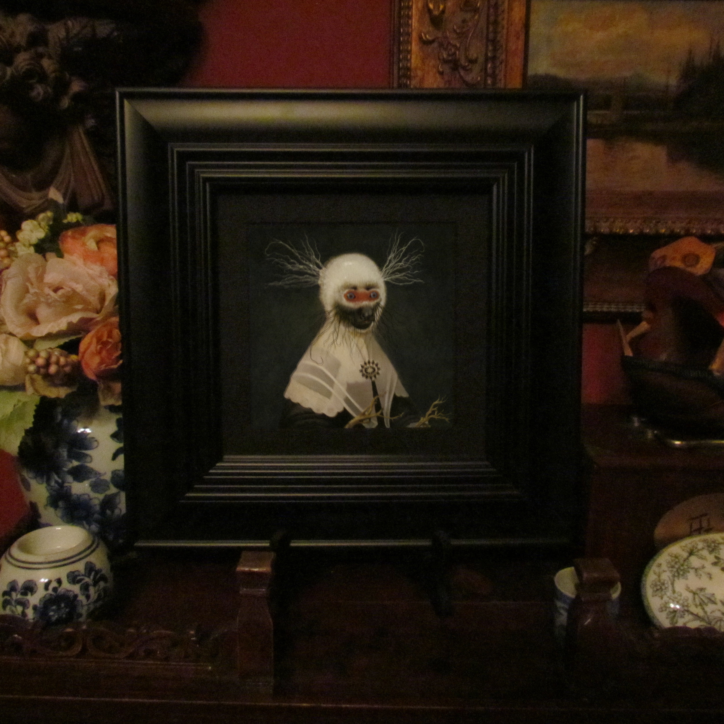
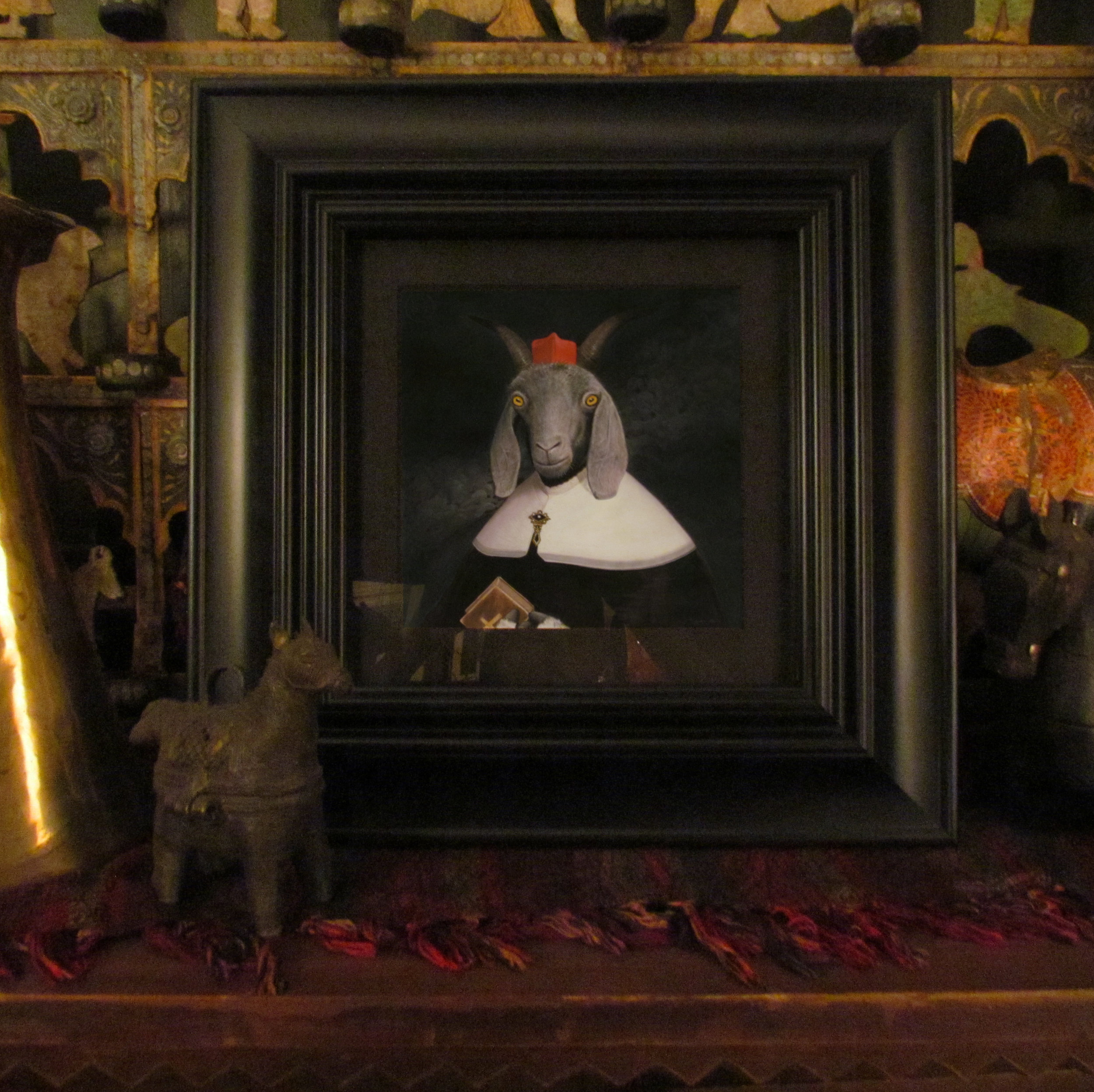
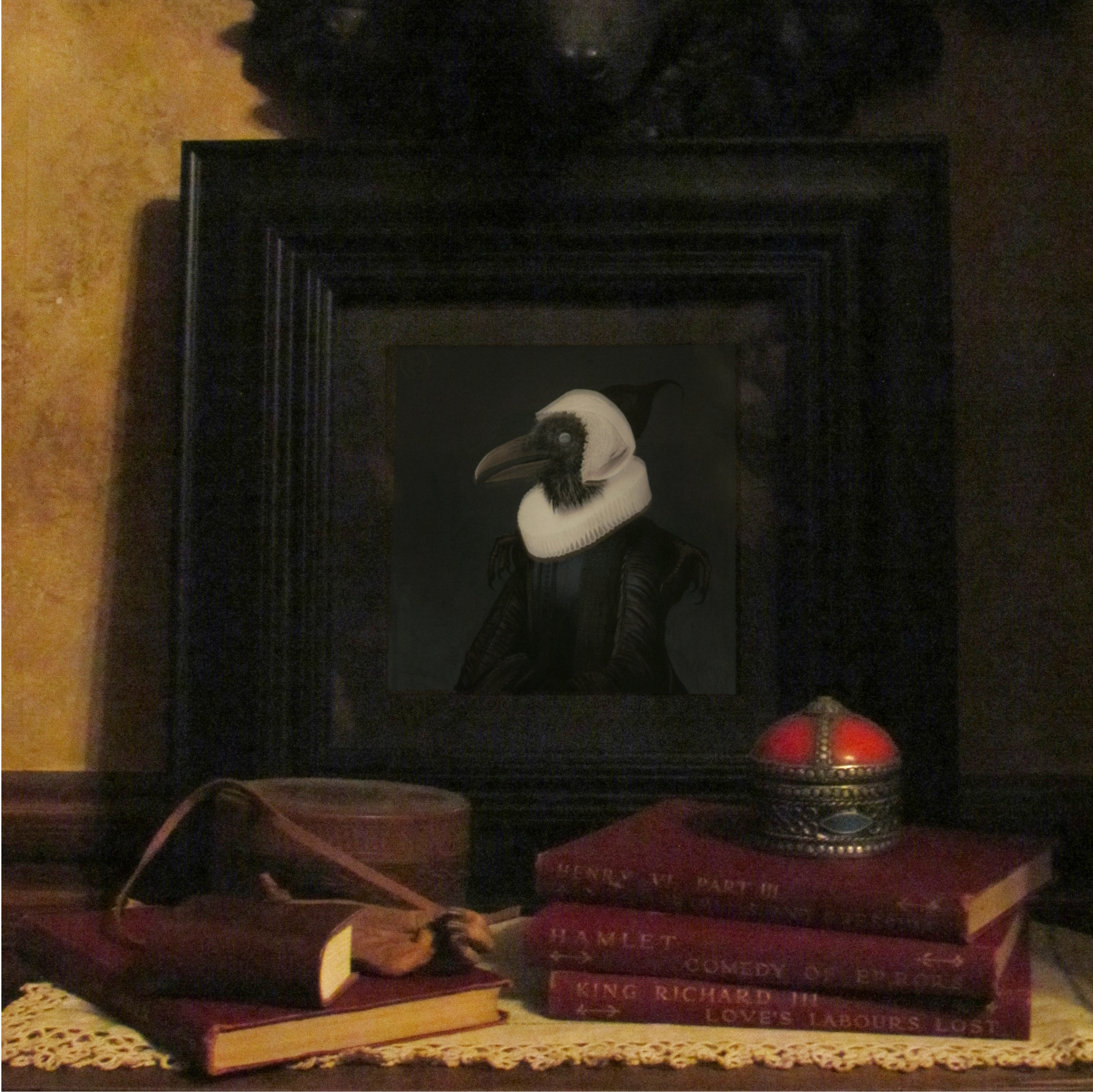
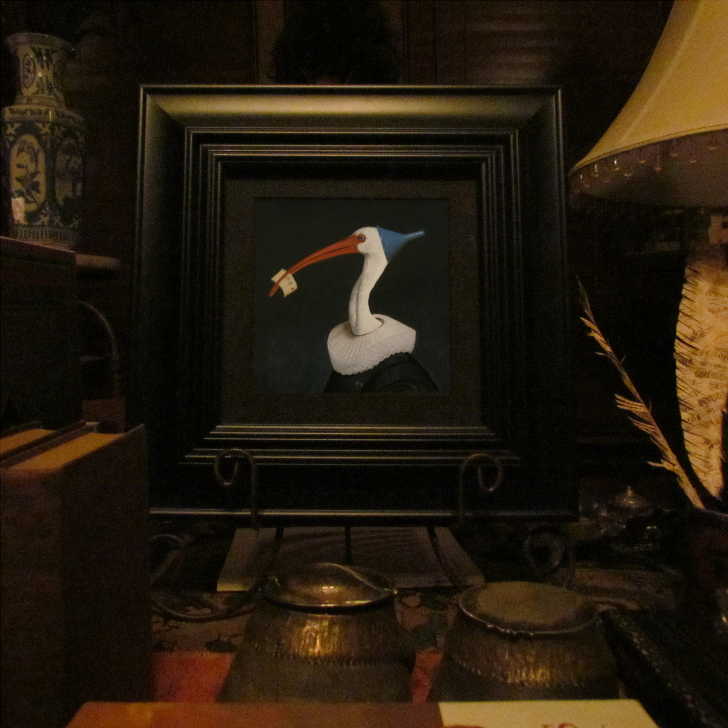
This group of strange little characters were painted for the WOW x WOW group show OTHERWORLDLY AND WILD, running October 6 to October 27 on wowxwow.com. Each of the paintings is 6.25 x 6.25 inches, framed in a heavy black wooden frame.

Originals are for sale via https://wowxwow.com/otherworldly-and-wild, and prints are available @ The Print Shop!

From WOWxWOW:

As human beings we have been granted many incredible gifts, and arguably, the most powerful of those when it comes to creativity, is the imagination. The world we experience is processed and filtered through our imaginations, helping to create our rich inner worlds and affecting the way in which life moves through us. Our inner worlds are truly unique to each and every one of us and have the power to transform our cultures and the environments we live in. Aspects of the external world are remixed internally and given new context, meaning and purpose. The limits of how far we push in new directions are only dictated by how inspired we feel at a particular moment in time. When firing on all cylinders, truly unique and wondrous inventions, innovations and creations are possible. Please join us this month as we celebrate the ‘Otherworldly and Wild’.


La Dame. Gouache on Hotpress Watercolor Paper. Bill Mayer 2023

Le Troubador. Gouache on Hotpress Watercolor Paper. Bill Mayer 2023

The Seer. Gouache on Hotpress Watercolor Paper. Bill Mayer 2023

The Timekeeper. Gouache on Hotpress Watercolor Paper. Bill Mayer 2023

THE 18TH ANNUAL BLAB SHOW!

Thrilled to be invited to join THE 18TH ANNUAL BLAB SHOW!
Big thanks to Monte Beauchamp for putting together stellar shows year after year.
This years show is at Bergamot Station in Santa Monica, California.
The opening night of the show is Sept. 9th, 2023, I'm sure it will be fabulous all around!

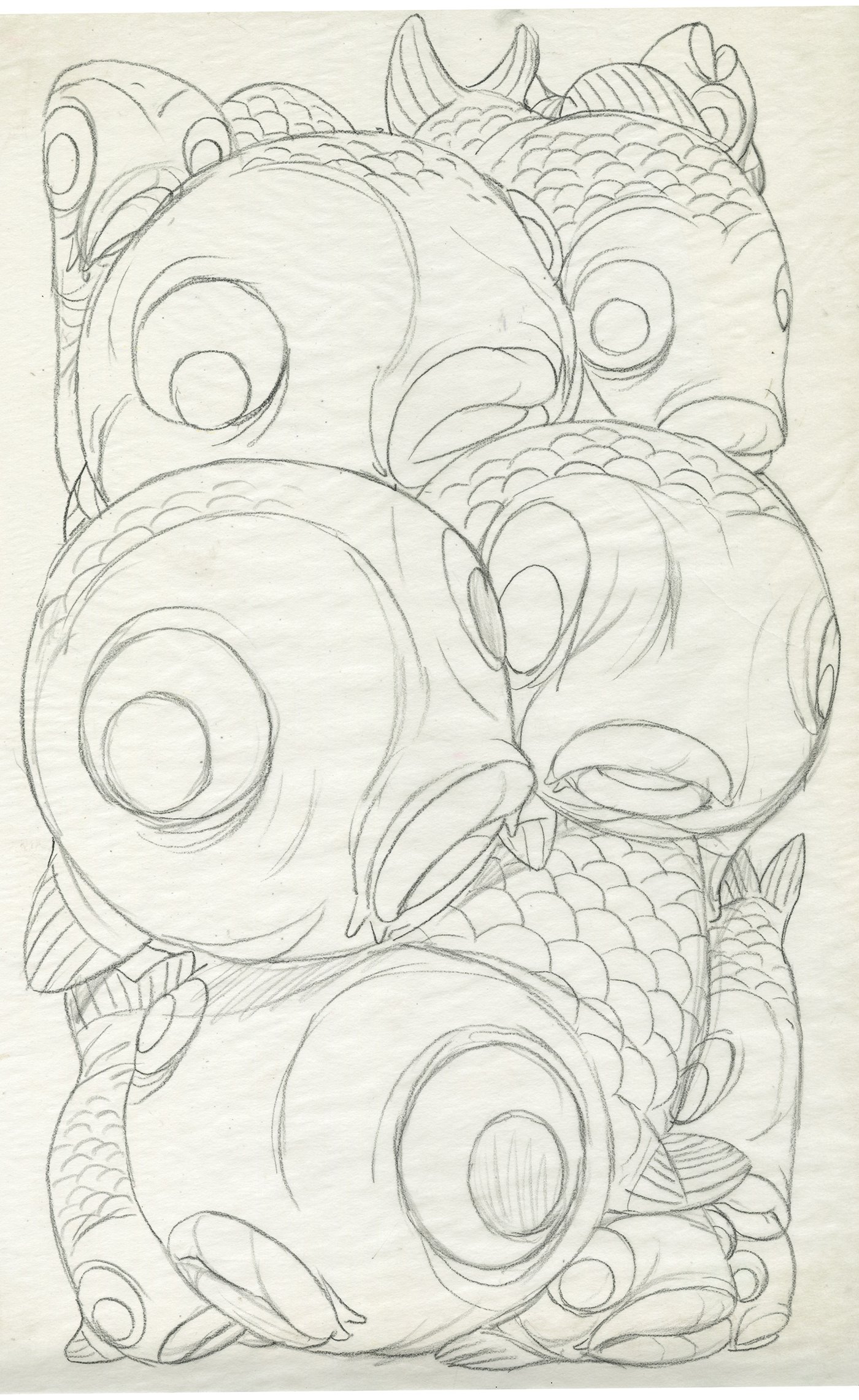
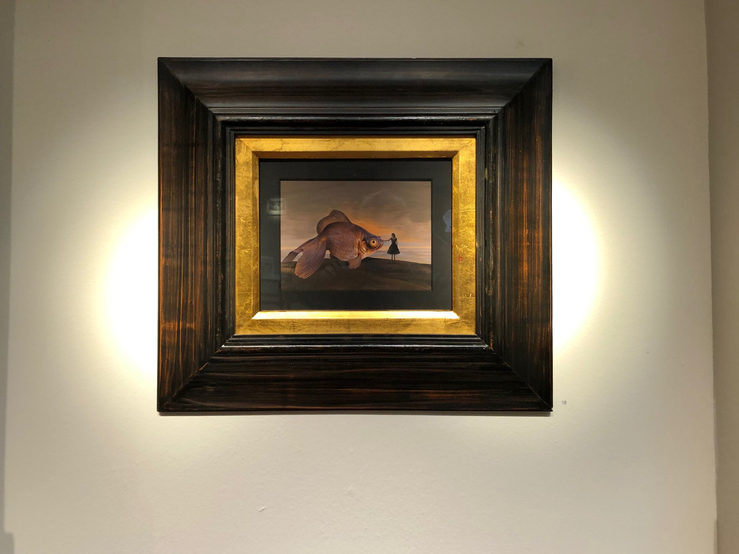
This piece is called “Black Goldfish at the Cliffs”.
Its 6.25” x 6.25”, framed in a heavy black wooden frame, totalling 15.5” x 15.5”
contact Gary Pressman @ copronason@msn.com for purchasing details of the original painting, or visit the print shop to order a 12”x12” print reproduction.

Black Goldfish at the Cliffs
Bill Mayer, 2023
6.25 x 6.25 Inches, Gouache on Hotpress paper

framed in heavy black wooden frame, totalling 15.5 x 15.5 inches.

Muckety Muck, from Orphan Barrel Whiskey Co.

Photo Credit: Alfred Barnard


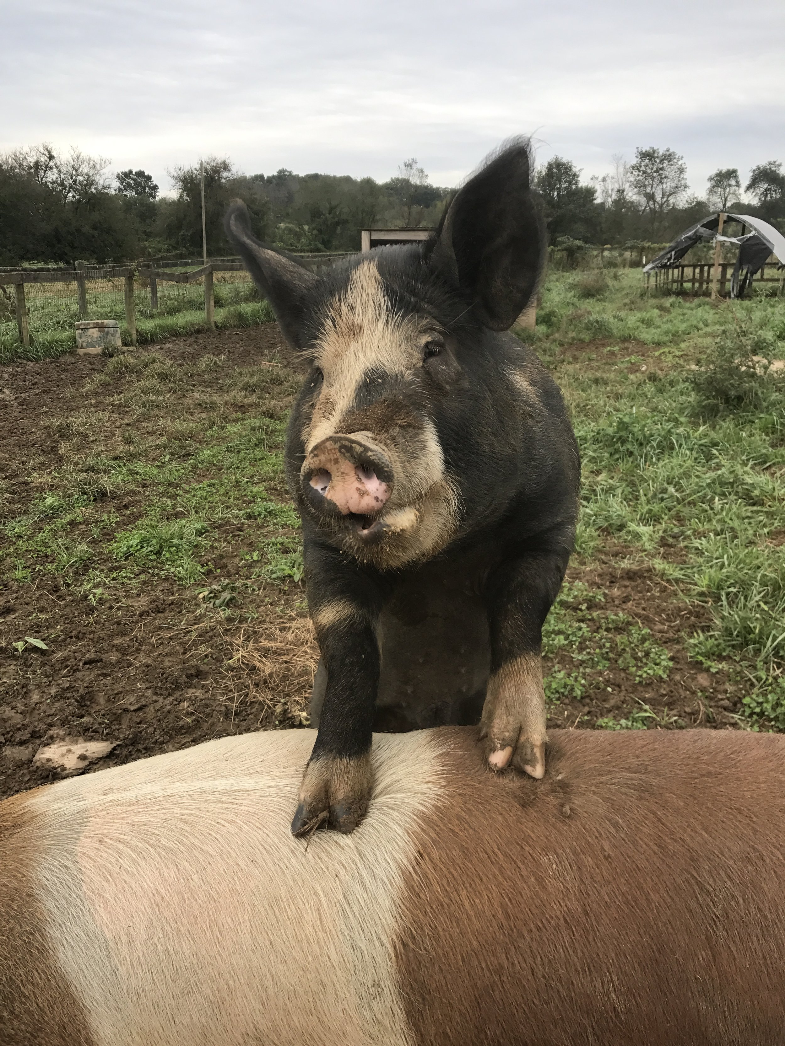
Another great opportunity to anthropomorphize a Berkshire pig in a collaborative project for Orphan Barrel. J P Elliot at JKR gave me a heads up they wanted to do a series of three Scotch labels for successive 24-, 25-, and 26 year old scotch whiskys. But first they just wanted to start on one. I started with a little research on antique packaging and old advertising to try to get the right feeling. I looked at cigar labels and patent medicine bottles for inspiration.

The name we started with was “Butchers Block,” so some some of the original designs had a different feel about them. When they changed the name to Muckety Muck everything started to fall into place.

A Muckety Muck is a person of great importance or self importance. It made sense to have the three labels be generational thing. The first one being the young statesman-like son. The other two which I'd do a year later would be the father and the grand patron... the grandfather.

There's a farm in Canada near the cottage, Maple Ridge Farm north of Kingston Ontario. Where we went with the boys Zak and Dash and visited my model for the Animal Farm series' Napoleon. A Berkshire boar named Turbo. A huge, imposing pig, living with his favorite sows and dozens of little piglet children. Lots of great Berkshire reference....

Turbo

Pork Chop (One of Turbo’s many children)


The whisky was recovered from the famous Port Dundas Distillery, so naturally the Scottish wardrobe made perfect sense. We found some old engravings of the building and the huge smoke stacks made it so recognizable. After researching Port Dundas some more I got some ideas for this setting on the docks with old historical buildings in the background. This seemed like a believable way to stage the portrait.

I did several passes on the lettering in a rough form but they decided to bring in a specialist Jason Carne who does the most brilliant hand-lettered vintage type. So glad they brought him on board . We worked close with the art director JP Eliot and the results were nothing short of brilliant.


Could not have been happier with the results. When they called a few months later and wanted to start on the second and third labels I was utterly delighted. It was great to pick up on these delightful pigs and bring the family to life. Each of the family I decided should not only be older but the clothing should also be more elaborate, elaborate to the humorous side of extreme.

they wanted to add a barrel into the composition as a place holder for the 26-year old version. I worked around that by having the grand patron seated, the other two flanking him in a jolly toast to the new year. Some holiday lights in the background also help with the festive mood.
I had lobbied for one character on each label because of the small size and the amount of information they needed in it, but they had a vision, and looking back it certainly does set the labels apart.


Much thanks to all of the folks who worked on the project,
To JP Elliot art director extraordinaire, and to Jason Carne, whose fabulous lettering just made the label a vintage advertising dream come alive.

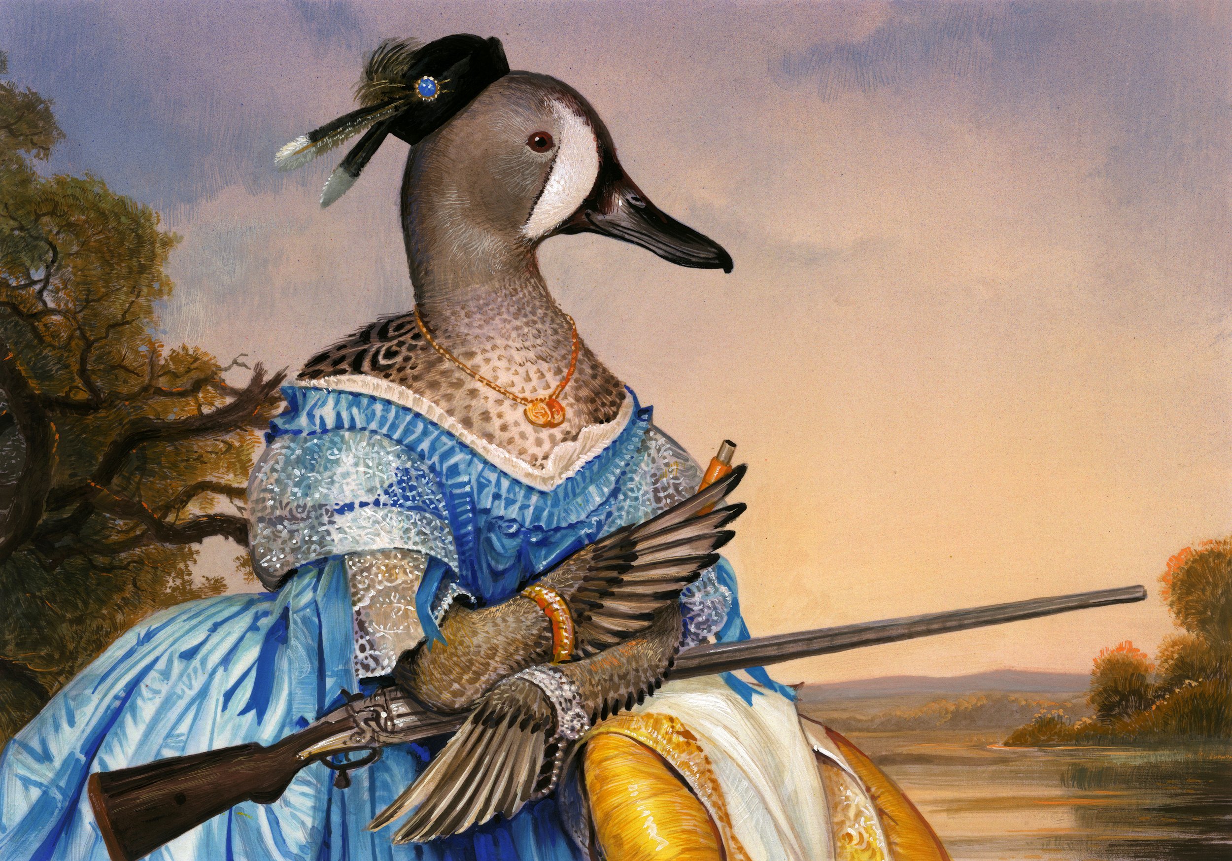
The Federal Duck Stamp Contest, Featured on “Duck Stamps: Last Week Tonight with John Oliver”

I had a wonderful opportunity to do a crazy project for a really good cause. The National Duck Stamp contest raises money to protect wetlands, a very prestigious national contest. It has come with some rather humorous conflicts, such as the bitter rivalry between artists Rob McBroom and Tim Taylor. One of the producers of “Last Week Tonight with John Oliver” contacted me to created for them a duck stamp following all of the rules and guidelines of the contest and enter it, and they would then film it and the auction off the originals. My original painting went for $25,000 in the auction and collectively all of the paintings raised $100,000 for a very good cause.

My assignment was to paint the judges as ducks, judging a painting of one of the required ducks for entries. I picked the Blue-Winged Teal Duck. The list of ducks you could paint from for 2021 was King Eider, Blue-winged Teal, Redhead, Ross's Goose, or the Greater White Front Goose. So the judges would need to be specific ducks from the list too. The judge concept was something they were really attached to, and although I presented alternate ideas they really were set on that direction. I picked the Blue Teal for my stamp painting to be judged by a section of ducks and geese. And of course some hunting references (required) spread subtly through the painting. The original painting was required to be 7”x 10” with a one inch mat so 9”x 12” total dimensions.

Sadly we knew our entry would probably be disqualified. The list of rules is pages long, and the one that was highlighted was the use of text or type in the illustration. Even though we knew was going to be disqualified, we were incredibly excited to take part in the show.
When “Duck Stamps: Last Week Tonight” aired we were at the cottage in Canada and a friend pulled up the live feed on his phone. I'm such a fan of John Oliver and his rant of a monologue had us on the floor laughing literally rolling on the floor. I'm very grateful to take part in such a fun project that ended up raising some money for a good cause!

© Last Week Tonight with John Oliver: Duck Stamps

© Bill Mayer 2021. “Duck Judges,” featured on “Last Week Tonight with John Oliver”

The idea we moved forward with was the one of the Duck Judges, but I couldn’t get some of my initial ideas out of my head of ducks in dresses, so I also painted a few of those concepts while I was at it. Unused alternates… “Cocked and Ready,” and “Open Season.”

Unused alternate. “Cocked and Ready” Bill Mayer, 2021

Unused Alternate. “Open Season” Bill Mayer, 2021

"Lucid Dreaming" a Gallery Show curated by Beautiful Bizarre

By embracing your subconscious, you gain a different way of seeing and experiencing—an expanded perception that opens a doorway, not only to lucid dreams, but also to the mythic dimension. As in lucid dreams, you see yourself or others with new eyes; your senses awaken and grasp an experience more fully than ever before; suddenly, you find your ears are open to hear with a deeper understanding
~ Jenny Davidow, Embracing Your Subconscious

Screen Shot 2021-04-20 at 11.02.31 AM.png

From My Dreams To Yours.

These Two paintings came after a pretty long break in painting . It was good to have a few shows as a deadline to push them along. I have always like paintings of flowers and have incorporated them in many paintings. They have a way of brightening the mood in the normally dark and creepy direction a lot of my work takes. There is a playful use of elements to evoke a dreamlike image.Here in the south Spring and summer come to life with an explosion of color and variety of Flora. One of our favorite spots for wild flowers is a place called “The Pocket” it’s off Hog Jowl Road near Lafayette Georgia. It’s a collapsed cave that has the most concentrated variety of wild flowers in the eastern united States. It’s hard for all of this beauty not to make it’s way into your Psyche.

Regalo de Verano (Gift of Summer) All of the paintings are done in gouache on watercolor paper. They’re an ongoing experiment with medium and composition and the potent nature of dreams, and to me there’s a sense of poetry in the playful use of surreal elements. I think there are no deep dark hidden secrets. It’s just fun to play with the emotions art can generate. I believe color is really emotion. Color choices are made to reinforce those emotions.

01-L.jpg
Regalo de Verano (Gift of Summer)

Regalo de Verano (Gift of Summer)

“The Wakening” Gouache on Paper. This series started as a reflection on the world through dream-like visuals. Continuing the Strange Dreams series, these little gouache paintings are painted with the dark dreams that sometimes seep into your subconscious, and in this series of paintings, I tried to put those strange dreams down on paper.

02-L Low rez.jpg
The Wakening

The Wakening

The Society of Illustrators Hamilton King Award

I am so thrilled, and honored by the Gods of illustration, to have this painting chosen
for the Society of Illustrators’ Hamilton King Award.
"Little Red Riding Hood," gouache on paper,
for Airbnb Art Director Mallory Roynon.
still one of my favorite little paintings...of course I feel undeserving and humble and I know there are
so many more talented artist that probably should have been chosen...but thank you all.

Red Riding Hood. Bill Mayer. Winner of the Hamilton King Award. Artwork © 2021

Red Riding Hood. Bill Mayer. Winner of the Hamilton King Award. Artwork © 2021

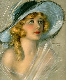
When I got the phone call from Tim O’Brien I was was really taken by surprise. Certainly awards are always nice to get, to reaffirm what we are doing as artists, but this one has some special meaning for me. It is in some ways a lifetime achievement award that can only be received once during you career. I think it was never on my radar until a friend, Goñi Motes, asked me a few years ago “how come you haven’t won the Hamilton King?” a haunting question that certainly had a way of putting it on my radar. when I got off the phone I realized I didn’t even know who Hamilton King was. (Of course he was the fabulous illustrator who was famous for those paintings of beautiful women on the collectable Coca Cola trays in the early 1900’s.

When you read through the names of the last recipients of the award they are in fact some of the Gods of Illustration. Victo Ngai, Chris Buzelli, Yuko Shimizu, John Cuneo, Tim O’Brien and so many more. It is a rather humbling task reading through the list. I am truly honored to have been chosen by these past recipients to receive this award. Unfortunately this year there was not an award presentation in person. It was a virtual event, not having an audience was a little odd. But the folks at Society of Illustrators did a stellar job making it enjoyable. It was fun watching all of the recipients do their acceptance speeches from their studios or homes. (or in one case what looked like the bathroom)

I want to thank the Society of Illustrators for honoring me this way. Lastly I want to thank my wife and life-long muse Lee for her support over the years. Wait, did I say lastly, of course I meant first) and my studio mate Forest who has become an incredible designer and art director and under his eye my work has grown exponentially.

A big thanks to Mallory Roynon and Airbnb for this great project, creating archival images to support an article about following the Grimms’ Brothers Fairy Tales through Northern Germany. she wanted the illustrations to add the dark and haunting side of the original stories not shown in the Disney versions most people are familiar with. All of these paintings were completed on a tight deadline which sometimes can be beneficial and cause you to trust your instincts. A few of the paintings she had me pull back a little from the dark side but they never lost their creepy appeal.

I still have not received the actual award (maybe there isn’t an actual award) but even if there isn’t one, the honor is not diminished for me.

lf.jpg
hamilton-medium.jpg

(Illustrations by

Hamilton King, 1871-1941)

220px-MarionDavies-Hat-1920.jpg

Warrior Queens

The Warrior Queens is a book project I finish almost a year ago but publishing is sometimes a very slow and sometimes painful to wait for. This was an interesting project with a lot of exact reference and historical documentation that had to be followed exactly to the letter.

It's a historical look back at six bad-ass queens who used their prowess and cunning to defeat some of the most powerful armies of the day. The cover was equally challenging to create a cover that had all of the queens and gave no importance to any one of them. Also during the process, we had to adjust any appearance to reflect the historical reference in dress , weapons and geographical locations to be accurate. The first step was to collect and categorize all of the reference. This I could not have done without the able and diligent Studio-mate Forest and Intern Dana Sanchez. They wanted a large portrait of the queen and a complicated battle scene that stretched across the spread. First step thumbnails.... then line sketches... with I tried to keep not quite finished as to give the final drawings a bit of spontaneity. Something that's very hard when theres so much time in between sketches and approvals.


tn35ie4rz2n7et39b9pa-1.jpg
Boudicca was queen of a tribe of Celts called the Iceni in eastern Britain in 60 CE. She led an uprising against Caeser's forces, and died shortly after its failure, believed to have poisoned herself. She is considered a British Folk Hero.

Boudicca was queen of a tribe of Celts called the Iceni in eastern Britain in 60 CE. She led an uprising against Caeser's forces, and died shortly after its failure, believed to have poisoned herself. She is considered a British Folk Hero.

Hatshepsut was a female pharoah in 15th century BC, who ruled and dressed as a man. She stabilized the government, put funds into infrastructure and roadways, and invested heavily in programs to spread the wealth among the common folk. Despite this,…

Hatshepsut was a female pharoah in 15th century BC, who ruled and dressed as a man. She stabilized the government, put funds into infrastructure and roadways, and invested heavily in programs to spread the wealth among the common folk. Despite this, after her reign, memories of her were destroyed by the following leaders, who did not want to admit how well a woman ran things. Archaeologists found proof of Hatshepsut’s reign in the early 20th century when they discovered a pit filled with destroyed statues of the kingly queen. Her statues were toppled, her name had been hacked away, and every evidence of her rule was either disguised or tossed.

The Queen and her sister, Trung Trac and Trung Nhi, defended ancient Vietnam from Chinese occupation, around 100 BC. They fought on the backs of elephants, and the Queens breasts were said to be so long, that she tied them up in cloth behind her bac…

The Queen and her sister, Trung Trac and Trung Nhi, defended ancient Vietnam from Chinese occupation, around 100 BC. They fought on the backs of elephants, and the Queens breasts were said to be so long, that she tied them up in cloth behind her back.

Zenobia was queen of Palmyra, in today's Syria, in 270 CE. Palmyra laid between the Roman and Persian empires. She took large amounts of land from the Roman army. She eventually enraged Rome so badly that they sent everything they could after her. S…

Zenobia was queen of Palmyra, in today's Syria, in 270 CE. Palmyra laid between the Roman and Persian empires. She took large amounts of land from the Roman army. She eventually enraged Rome so badly that they sent everything they could after her. She was forced to surrender, and with her life spared, was taken back to rome in chains to be a “good roman wife” to a senator.

Artemisia, 5th century BC, played a key role in the battle of Salamis between the Greeks and Persians. She was Greek, but fought for Xerxes and the Persians.

Artemisia, 5th century BC, played a key role in the battle of Salamis between the Greeks and Persians. She was Greek, but fought for Xerxes and the Persians.

Amanirenas, 40-10 BC, was the Queen of the Kush Kingdom, in modern day Sudan. She was a true warrior and fought at the front lines in conflicts, losing her eye in one such battle with the Romans. Nubians were found to use special antibiotic yeasts i…

Amanirenas, 40-10 BC, was the Queen of the Kush Kingdom, in modern day Sudan. She was a true warrior and fought at the front lines in conflicts, losing her eye in one such battle with the Romans. Nubians were found to use special antibiotic yeasts in their beer brewing, and everyone after childhood drank this special brew that protected them from infections or sickness.

A special thanks to all of the folks at Boyds Mills Press. And to the fabulous art director Barbara Grzeslo for thinking of me a giving some space to get something that was so much fun....

Available now on Amazon

“Is Death Reversible?” for Scientific American

A great article for Scientific American about research they're doing on reanimating dead brain tissue. Specifically pig brains hooked up to a machine that mimics the heart. It also included a nerve inhibiter in it to prevent it from becoming aware... I have done a lot of pig illoz and seemed appropriate to concentrate on the human side and the questions of bringing back loved ones.

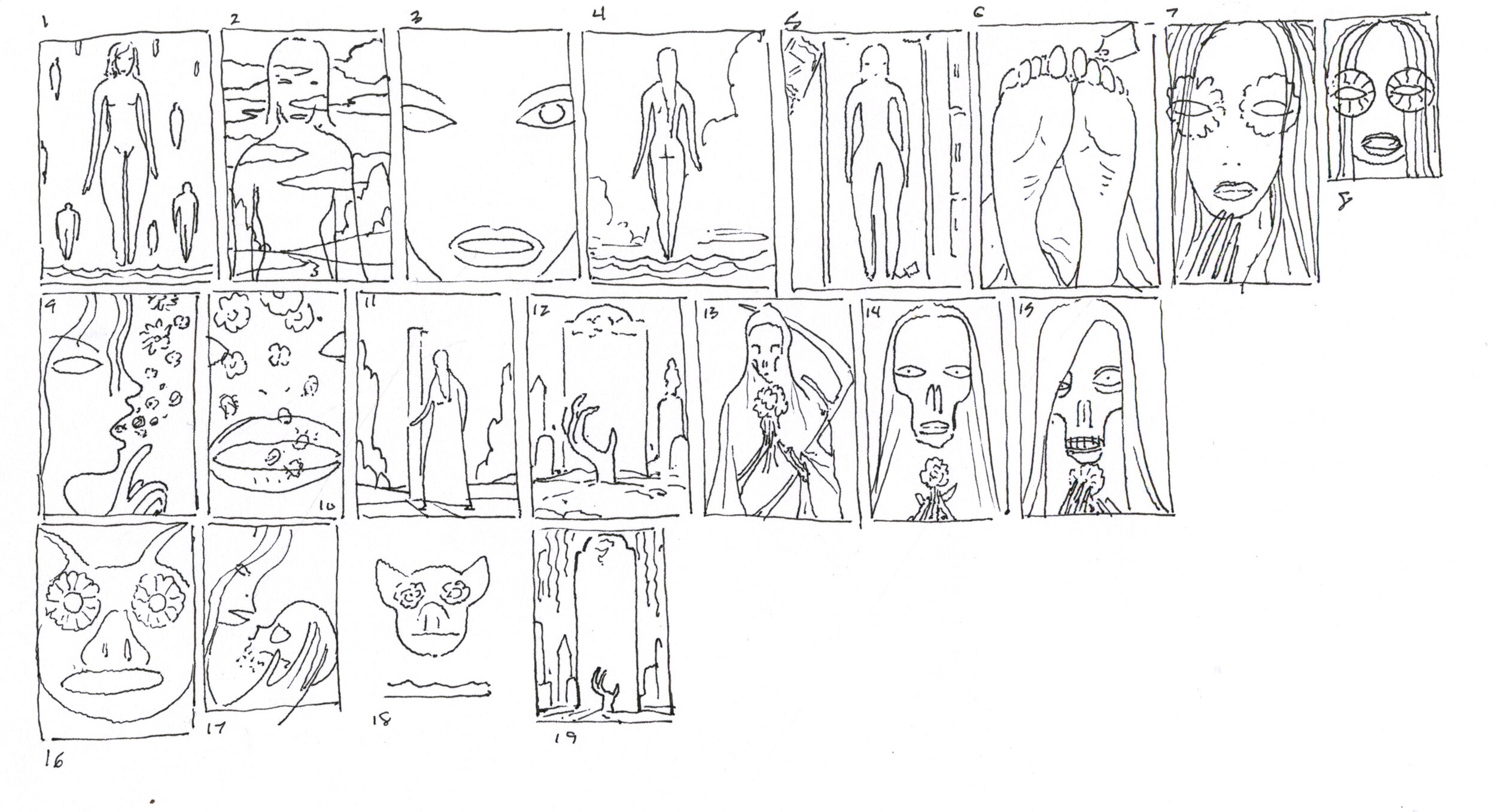
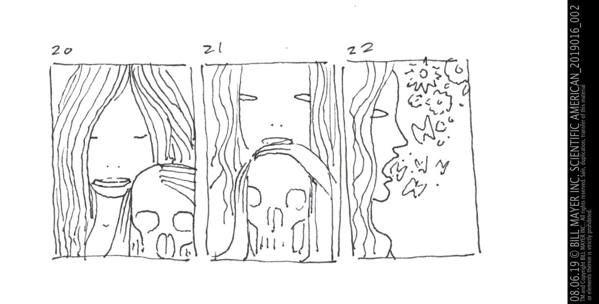
In the original thumbnails I had thought a sort of play off of Shakespeare's Hamlet (Poor Yorick) visual, but Forest thought it would be better and more thoughtful if the lady related to the skull more. Like it was a loved one, or a child lost... There were lots of great ideas here in the thumbnails... Some strong directions I may come back to down the road.

I shot some reference photos of Lee and Victoria to make the hands resting on the skull feel soft and natural... (I used the skull off the studio skeleton “Bob.”) Kind of humorous trying to style a photo without removing his head, but I got something that worked pretty well.

I added some more symbolism into the illustration with the background being dead vines and leaves on the left side and living blooming flowers on the right. I decided to add butterflies coming from the skull.... I went with a a more squared off composition rather than the profile and a tight cropping that would be more impactful as a full page.

The final I painted in gouache... I wanted the color to be warm and glowing.
Everything on this one seemed to flow just right. No second thoughts...well except making her head/hair a bit smaller... it all went pretty much like I'd hoped.

Much thanks to Michael Mrak for the opportunity to jump on this after a vacation... Super fun painting, and a brilliant type layout to go with it.

FINAL-L.jpg
70553454_10216151317910701_7486590590675582976_o.jpg

All Art © Bill Mayer 2019

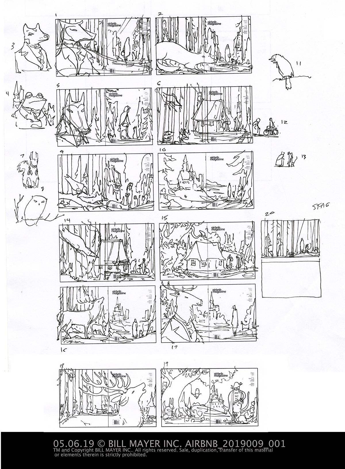
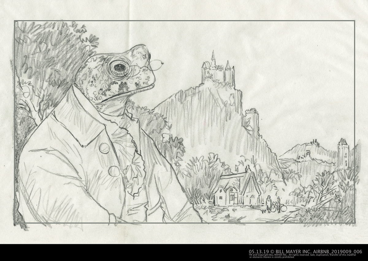
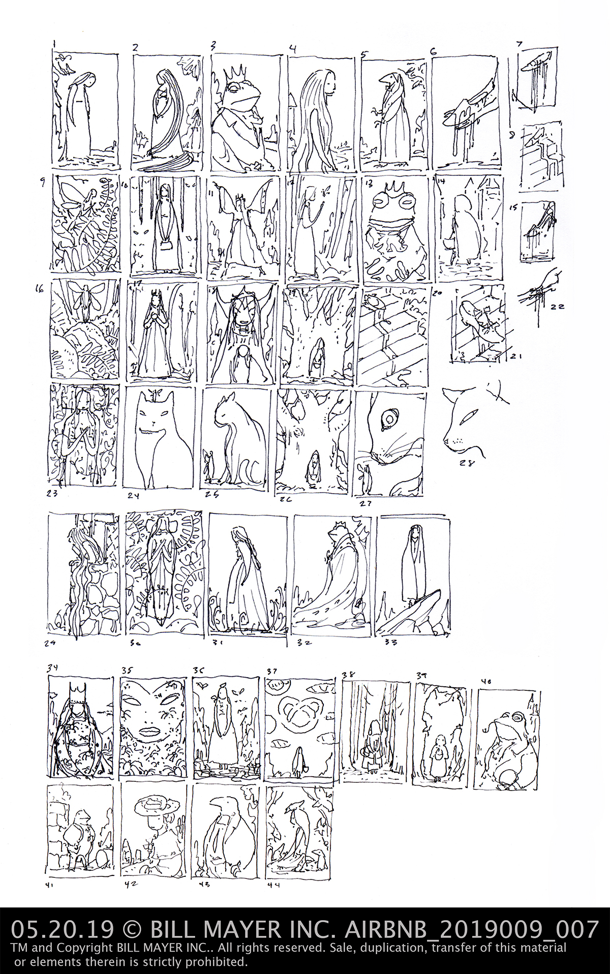
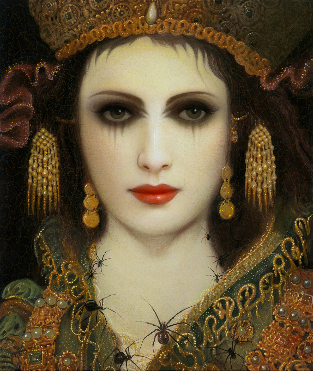
A Grimm Road Trip: Airbnb Magazine

Had the opportunity to do a great series with Mallory Roynan over at Airbnb Magazine, for an article depicting the “German Fairy Tale Route,” an, unguided, unmarked Brothers Grimm road trip through Northern Germany. With over 40 stops including Cinderella’s Castle and Rapunzel’s Tower, this trip takes you through the heart and soul of German Fairy Tales.
Illustrating characters from these tales help form the mystical landscape they happened in.

Read the full article at Medium. https://medium.com/airbnbmag/grimm-brothers-road-trip-2cb82a18335c

Sierra Magazine: Does a Bear Think in the Woods?

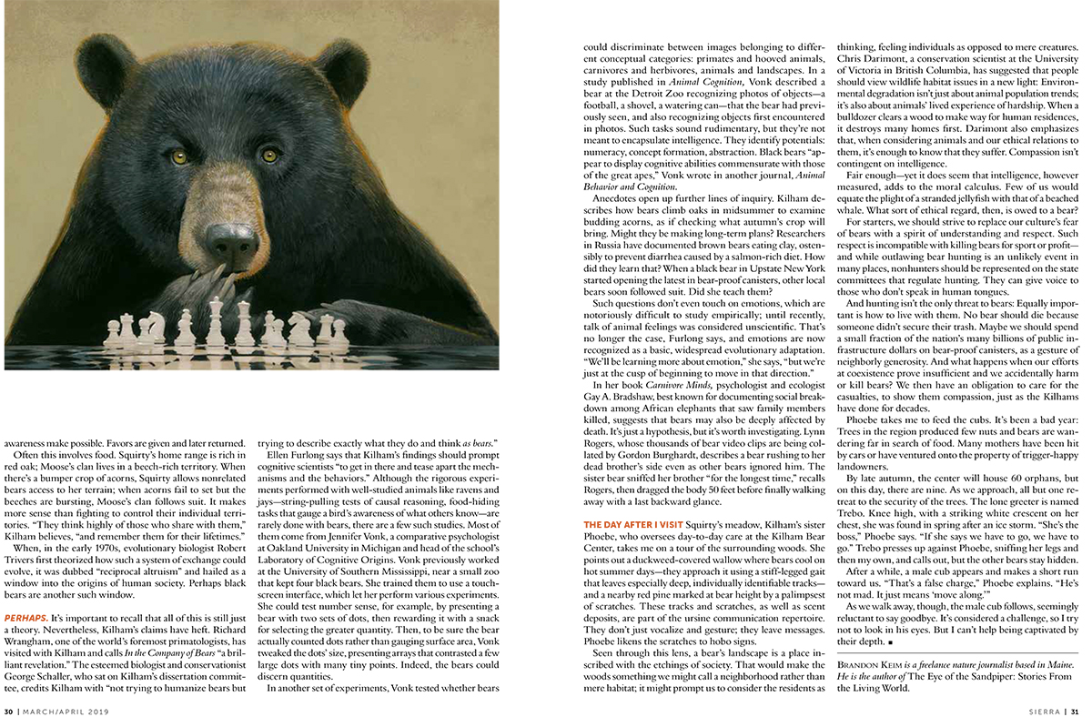
A great new project I recently did for Tracy Cox, supreme divine art director at Sierra Magazine, on animal cognition. Specifically, the author Brandon Kiem talks about Black bears and their keen intelligence. Read the article here!

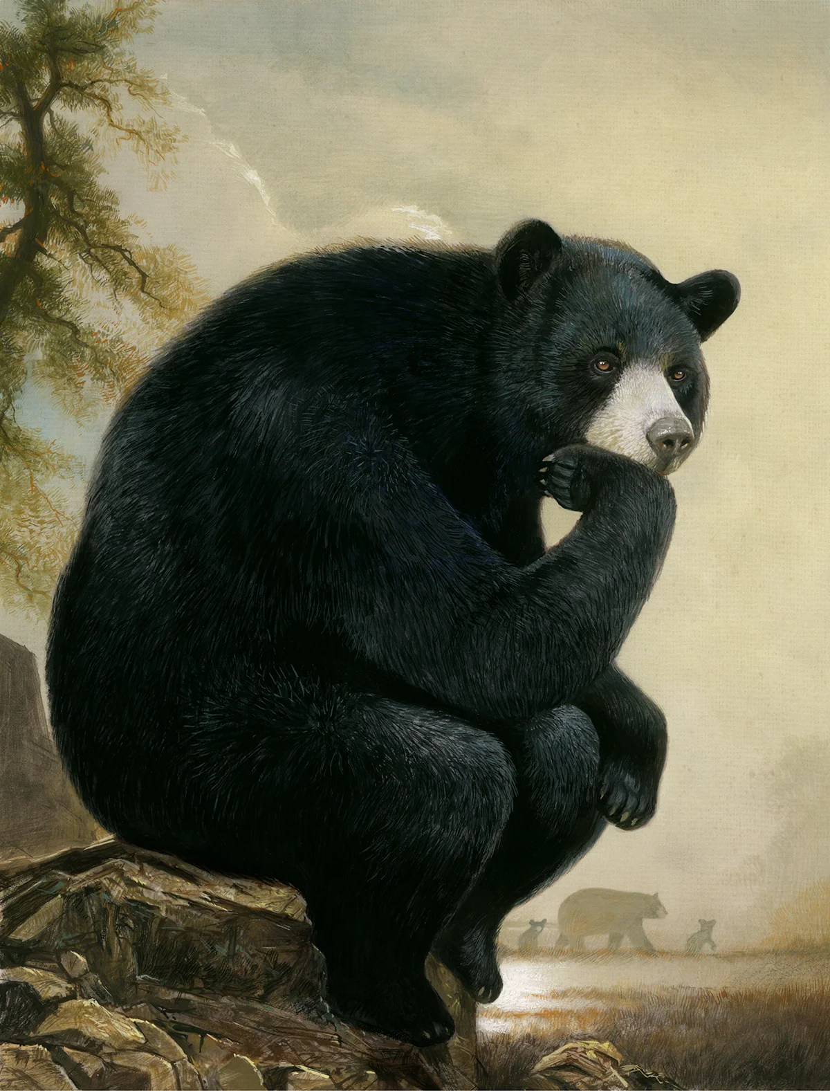
They had some direction for the cover using the Rodin seated figure from the “Gates of Hell” popularly known as “The Thinker.” I had not looked at this sculpture in a long time. and was struck by how the concept worked so much stronger as a part of the whole gateway (Gates of Hell). A man contemplating the past. But this pose has become a cliche’ on it’s own… Definitely something that would be a challenge to make fit in a non-humorous way…. Bears are just so fat…

Cover
“Chess Bear” spot for Sierra magazine ©Bill Mayer 2019

“Chess Bear” spot for Sierra magazine ©Bill Mayer 2019

2019001_001.jpg

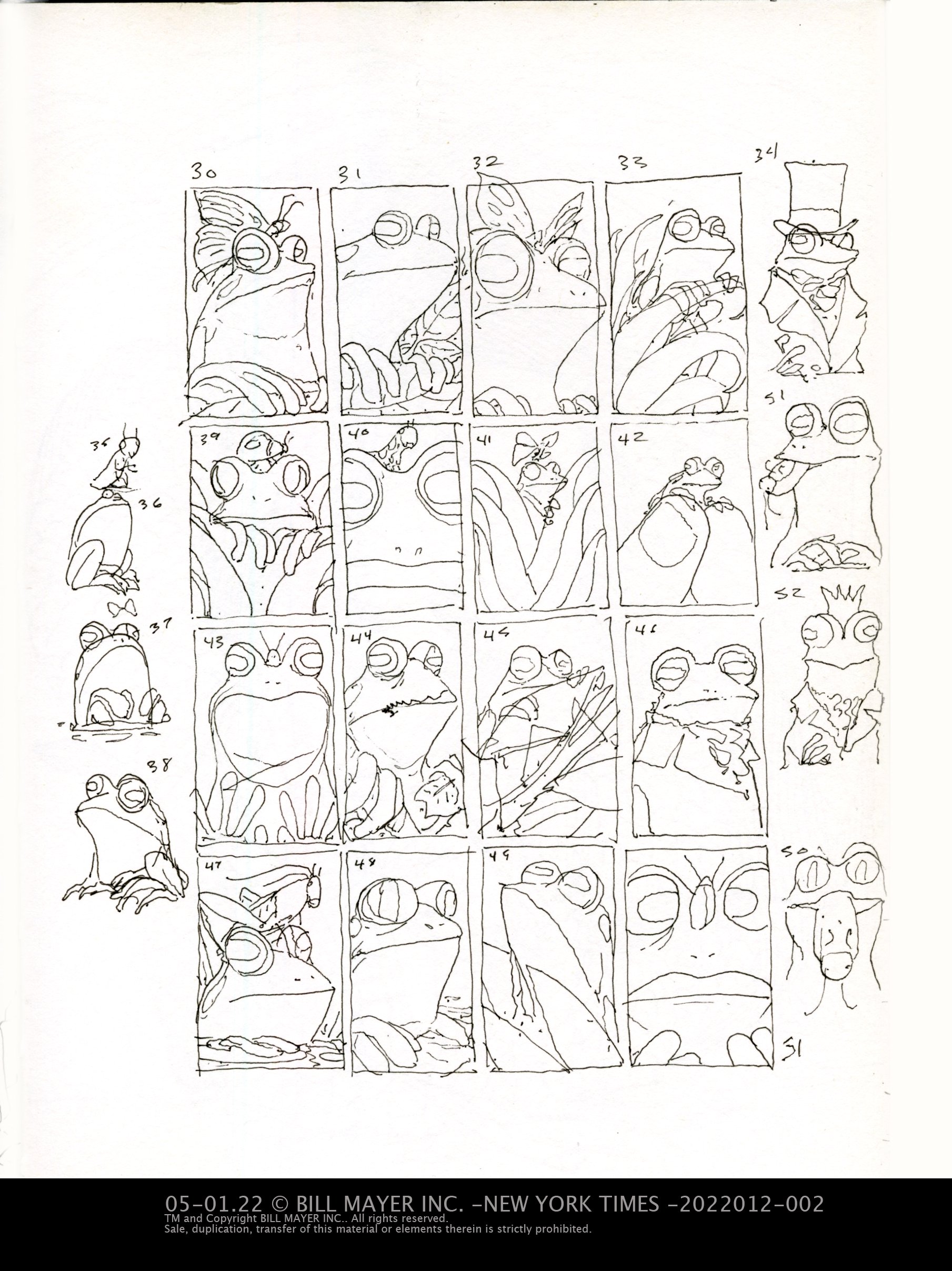
First thumbnails where I was trying to sort out where to go with the cover and the two other illustrations. The Chess-playing Bear seemed like an obvious one, as well as the reading bear…. I did play with putting the bear in human cloths but we decided maybe not quite the right tone…

The one they picked was#19 for the cover. #5 for the chess playing bear spot…(above) and they liked the idea of the reading bear. But I took and drew them up tighter because it’s sometimes hard for people to see past my humorous playful thumbnails.

2019001_002.jpg

My original idea for the reading illustration was to use a huge Grizzly and a tiny book, I thought would be a striking contrast. But the article really was about Black bears so that changed to be more accurate. We did some tweaking back and forth trying to make the pose work.

“Sitting Bear” Cover for Sierra magazine ©Bill Mayer 2019

“Sitting Bear” Cover for Sierra magazine ©Bill Mayer 2019

after some tweaking on the pose the Black Bear seemed to work pretty well. I decided to add a simple tree behind him to help. Lastly I came back after it was finished and gave him a tookus… to sit him down and add some weight to make him look a bit more natural….

The reading bear was working well, one side note I had the bear reading Darwin and the editor suggested maybe his less famous book on animal emotions… a little subtle twist I’m not sure anyone will actually catch, but some request are too easy not to comply. In the final I decided to add some trees into the background to give an impression of the outdoor environment. It also made it a bit different from the spot illustration. the finals certainly seemed to work well in the magazine… For now I am ready to paint anything but bear hairs…. Thousand of bear hairs…

“Reading Bear” inside full page for Sierra magazine ©Bill Mayer 2019

“Reading Bear” inside full page for Sierra magazine ©Bill Mayer 2019

New Gouache Paintings at WOWxWOW!

I just finished four new paintings for an upcoming show on WOWXWOW.com

It had been a while since I had done any personal work so it was good to have this on the calander to force me to take some time and actually paint something for me. I had several large projects that had deadlines and certainly a lot of personal stuff that filled my days.
I have returned to looking a lot at Goyas work lately. In art school he was certainly one of my favorites. Forest had been searching around and we were looking at his series of dark paintings he painted on the walls of his house.(The Black Paintings) I guess that was why I decided to title these in Spanish. That and my new intern that was helping me name them is from Colombia.... It just felt like it fit.

To purchase the originals and to see the rest of the show, head over to Vestiges to Voyages

©BILL MAYER 2018 El Ministro Del Conocimiento (The Minister of Knowledge)

©BILL MAYER 2018 El Ministro Del Conocimiento (The Minister of Knowledge)

©BILL MAYER 2018 La Cabra Beata (The Pious Goat)

©BILL MAYER 2018 La Cabra Beata (The Pious Goat)

©BILL MAYER 2018 El Vidente (The Seer)

©BILL MAYER 2018 El Vidente (The Seer)

©BILL MAYER 2018 El Diácono (The Deacon)

©BILL MAYER 2018 El Diácono (The Deacon)

These four paintings;  "El Diácono," "El Ministro Del Conocimiento," "El Vidente," and "La Cabra Beata," are done in gouache on watercolor paper. They’re part of an ongoing experiment with medium and composition and the potent nature of dreams. I believe color is really emotion. Color choices are made to reinforce those emotions. I think there are no deep, dark, hidden secrets. It’s just fun to play with the emotions art can generate. To me there’s a sense of poetry in the playful use of surreal elements.

Continuing in the Gouache Series, “Strange Dreams,” this collection of four portraits portray the nature of piety.
It is a humorously haunting theme reflecting a bleak outlook on humanity and religion.

Service Stars! PLANSPONSOR

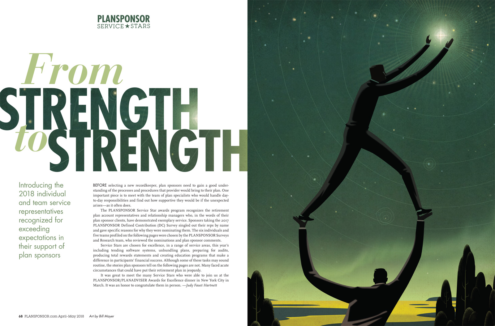
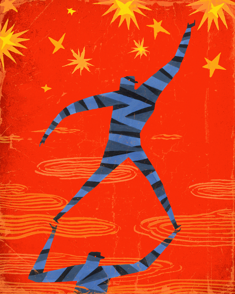
One of my favorite Art Directors SooJin Buzelli called me about doing a new job for PLANSPONSOR, a simple one page Illustration. This was a very simple concept taken from one of the usual 50 or so thumbnails. I think the design on this spread worked so well and really played off the color in the sky. Some last minute scrambling to get it all tweaked right  I added the northern lights to give the horizon a sort of mystical feeling. 

PSAM18_SvcStar_Bill-Mayer.jpg

A very simple limited color palette to keep that starry evening feeling. Conceptually the advisor on the bottom is helping the client reach for the stars. Really a literal interpretation of the "Service Stars" line.

Originally the figures were obscured by clouds, but in the final version I decided to nix the clouds to make the image read faster.

20180013_final_revise_420.jpg

 This lower illustration was an after thought. A naive, graphic direction I thought of and presented as an alternate. It received warm reviews but we stayed on track with the original direction, which SooJin felt was more appropriate. 

Much thanks to SooJin and the folks at PLANSPONSOR.

20180013_final_op3.jpg

50th Anniversary of the Assassination of MLK

1018012_02_FINAL REVISE.jpg

I got call from an old friend and fabulous art director BA Albert asking if I would do a quick turn around poster for the 50th anniversary of Martin Luther King’s murder. A local underground newspaper wanted to do a special promotional issue. They were going to print a letter our Senator John Lewis had recently written to MLK about what it had meant to him as a 16-year-old meeting with him, and how it had changed his life and path to the future. The wanted me to do a 24 x 36 poster that would be folded into the paper.

2018012_002.jpg

It was Monday, and posters due Friday. Seemed tight, because I was in the middle of a large publishing project and that would have to be set aside to make room.

It felt like something that needed to be done with the right tone and feeling. I had a short conference call with BA and Blake Tannery, the art director at ICON. pulled together some reference on JL, and MLK and started on thumbnails. There was a police photo from John Lewis's past that just struck me as such a strong photo.

I always love the beginning of a job, conceptually somewhat open and direction not tied down. It’s just a visual stream of ideas that sometimes play off one another. Sometimes when I do a poster I add color to my thumbnails. It’s important perceptions that sometimes help things read. There were some great ideas. We hashed them out in a conference call and they suggested the possibility of doing a two-sided poster. I decided to do three of the posters. They loved the idea of the police photo but we all agreed it needed some conceptual element to make it work.

MLK.jpg

Things didn’t really go that smoothly. I have a hard time with portraits and I must have started over four or five times, finally stayed late and got one that seemed to have the right feeling. The mug shot of John Lewis was painted in Gouache, the type at the bottom a combination of blown up digital print and bad Xerox copy. But I loved the weird way it distorted the type.

Final 03_ship.jpg
John Lewis.jpg

My initial idea for the JL poster was to have flowers on his eyes like a nod back to those peace posters from the 60’s. I thought it was an ironic contrast with the stark police photo but Blake got some push back from CL saying “I’m getting everything from white appropriation with flower power to Day of the Dead. Geesh. ” Lee had already expressed some feeling that it was not the right approach so I quickly came up with a simpler solution making the reflections in the eyes into doves. Forest thought it made his eyes sparkle. A much better poster.

In my initial thumbnails I had tried a cople of variations with hand written type that seemed problematic with my spelling and the time for editing nonexistant.

The three posters were designed to have the letter included on the front in a column. The yellow poster to have the Letter on the back. I thought the yellow poster was by far the strongest direction.

Much thanks to Creative loafing, the folks at ICON, my old friend BA and Blake Tannery. Much fun working with you guys.
Read the letter here, https://creativeloafing.com/content-405378-Letter-to-Dr.-King

1018012_02_FINAL REVISE.jpg

Radio Flyer's 100th Anniversary Kid's Travel Agency

Radio Flyer's 100th Anniversary "Kid's Travel Agency" Posters.

Radio Flyer is hosting the first ever kids travel agency to celebrate 100 years of inspiring imaginative play and unforgettable adventures. At Radio Flyer Adventure Travel, children are introduced to impossibly wonderful destinations they can visit only with their imagination and a Radio Flyer. https://www.radioflyer.com/travel-agency/

"See Octopus Shiny Treasure Bay" © Bill Mayer 2017

 A new poster for Radio Flyer. FCB had a great idea to inspire kids to use thier imaginations through a series of travel posters to fantastic places that only could exist in dreams. the instructions and specs for the poster came in with a huge packet of materials and spec. More than I ever remember getting in the past on any project... But once I had gotten through going over all of that. It just started off in the normal way all jobs do, with a little research looking at old travel posters to get a feel for the atmosphere and feelling of a vintage poster to a fantasy destination. I am always drawn to bold, simple images so I explored in the thumbnails various compositions tackling the manditory elements. I wanted the octopus to be huge, larger than life. Looming and imposing, but not scary. I decided to make the wagon into a ship.

I tried two directions: one, the octopus as the island towering in the distance; the ship and kids in the forground. The other using the wagon as a bathysphere, exploring an underwater world in search of treasure. I'm not sure they really got the underwater thing from my thumbnails, but Kevin picked a couple very similar directions and i started refining the sketch.

thumbnail for Octopus Shiny Treasure Bay. They picked #1 and #8 both very similar directions.

thumbnail for Octopus Shiny Treasure Bay. They picked #1 and #8 both very similar directions.

Slightly tighter thumbnails working out prportions on size of the boat and octopus.

Slightly tighter thumbnails working out prportions on size of the boat and octopus.

In process art for the octopus almost finished....I know, airbrush, it's just so much faster for me... Some textures and highlights I will add in Photoshop later....

In process art for the octopus almost finished....
I know, airbrush, it's just so much faster for me... Some textures and highlights I will add in Photoshop later....

I wanted to add some cloudy atmosphere to separate the background, make it lighter against the silhouetted kids and boat. I decided to do the kids and boat separate from the octopus to give me the option of adjusting the size and placement. I added distant mountains, birds, and treasure to reinforce the size of the octopus without reducing the size of the kids and wagon. Ultimately I decided to have the ship coming out of the shadow slightly to allow some details to show.

When I first pulled everything into the poster I loved how the wagon and kids looked just floating in the sky.... After I had put the final poster together I roughly pulled together a variation to show the Art director. Ultimately they decided to stay with the original design.

I was really happy with where this poster ended up. I was great fun working with Kevin Grady and the creative team at FCB. They gave me a ton of freedom and that always pays off in the final result. Cant wait to see the final 24x36 printed posters... So much fun. I need a few more of these to work on.