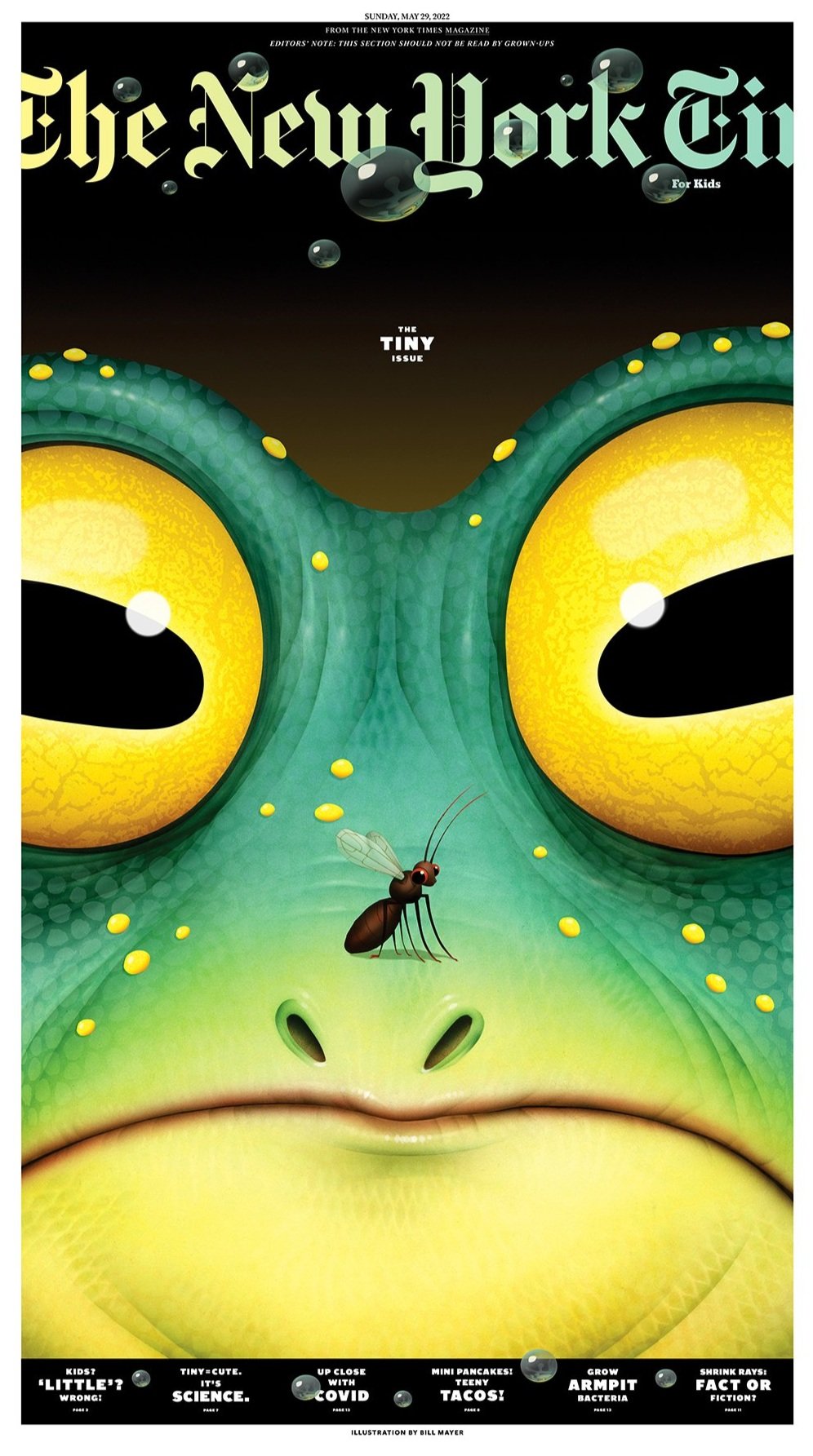
A couple of weeks ago I got a call from Debra Bishop at the New York Times about a cover illustration for the “Tiny “ issue of the “for kids” section. She had pitched one of my drawings and the editors had approved. So, we are off and running.
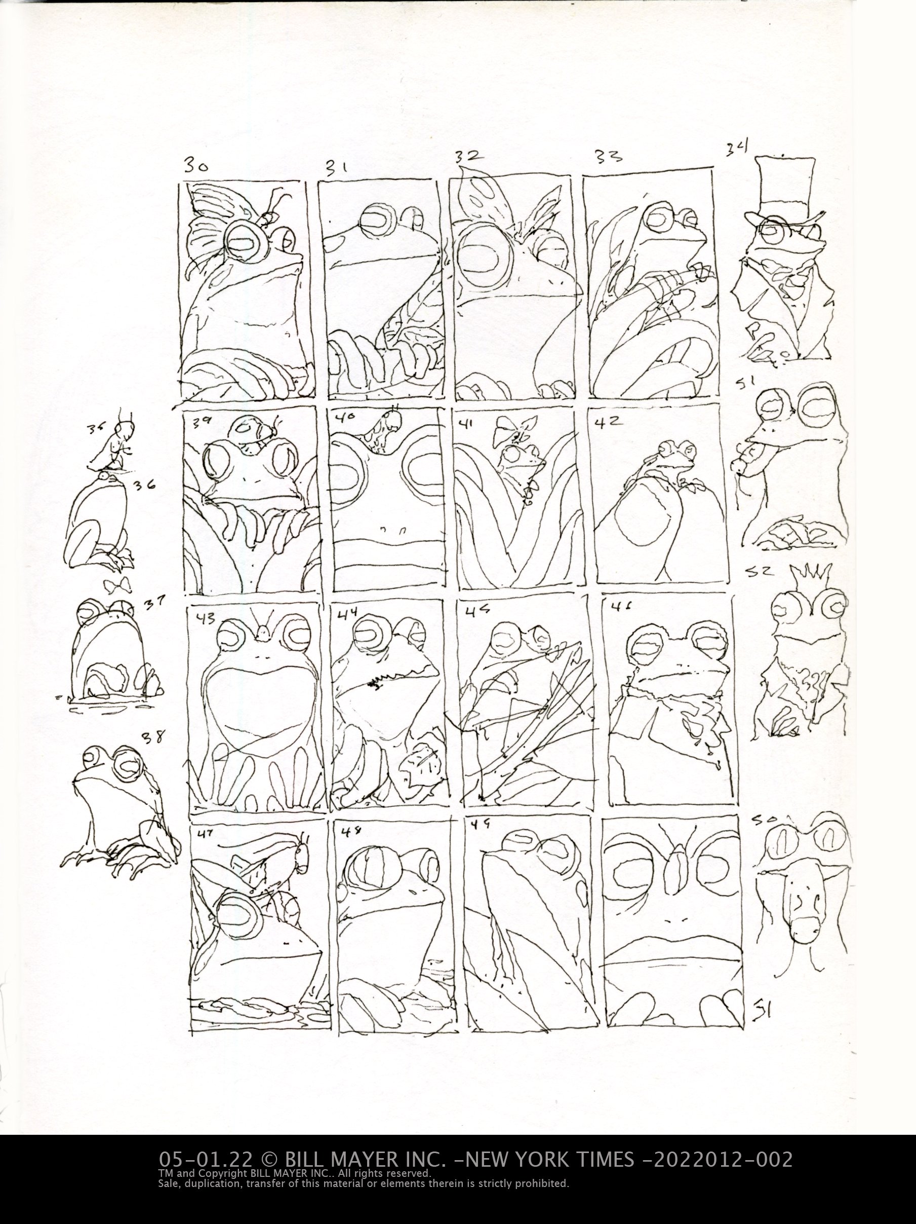
These great projects are so much fun, and so visible to the public... I was thrilled to be doing one. For her pitch, she had used one of my graphic frog illustrations done for Dellas Graphics frog calendar some years back. The input from the editors was that it needed to be an actual species of frog, not one made up, which is what I usually did on those calendar illustrations. It also needed to be a tiny frog that would be blown up huge. I did the normal 50 or so (yes I know, overkill) thumbnails. But I love this part of a project when you can think through the design challenges and conceptual elements. There's always tons of direction it can go. I'm always just trying to sort out the best options.
I think the direction she picked was already in her head somewhat, so it was not surprising the direction it went. Some of these other thumbnails I may circle back to in the future... I do love frogs!
I did a little tighter sketch in proportion to our layout and picked three frogs that might work. Of these I think my favorite was the Poison Dart Frog because of his strange coloring, it would have made for a really graphic cover. The editors felt that it didn't read as a frog quick enough so we ended up going with the “San Jose Cochran Frog” or the Cochranella euknemos. Here are the color roughs I put together with a picture of the frog next to it.
The San Jose Cochran Frog, Cochranella euknemos,
Image provided under Creative Commons License by Brian Gratwicke
And we are on to the final.
The illustration was from its inception envisioned as a supergraphic airbrush style. It was fairly simple image so it seemed totally appropriate to do it this way. It was strange to fall back into a style I have largely moved away from. I had to scramble and find the materials I used to use to do my traditional airbrush paintings. Hot press Straphmore illustration board... had to get a tank filled with air. All of this was always on hand back when I used to do these illustrations every week. The drawing went fast, and I was through with the cover illustration and scanning it in within a day. While editing the cover, Debra decided to add an inside illustration of the same tiny frog for the inside. I did a few options and we decided on the frog under a mushroom.
When Debra works on these sections she seems to work very fluidly. She came up with the idea to do a bunch of little “sprinkles” of frogs throughout the section of the paper, tiny frogs throughout the articles. Although we discussed doing a group of different frogs, we finally settled of tiny versions of the cover frog. Like a mascot leading you through the paper. She provided me with a color guide for the issue to help make everything mesh well together.
The frog on the inside needed to be actual size of the real frog, 28mm or just about an inch. I painted the frog separately so he could be adjusted to the right proportion.
The small “sprinkles” I decided to do digitally on one document to keep the look and color consistent. We shipped everything off, and jumped on a plane up to the cottage for our anniversary. We are a bit isolated at the cottage...
It would be a week after this whole thing was printed before I got to see it in person. It was such a thrill to see this in print! Debra Bishop does such a masterful job of making us all look good, and the design was simple and perfect.


