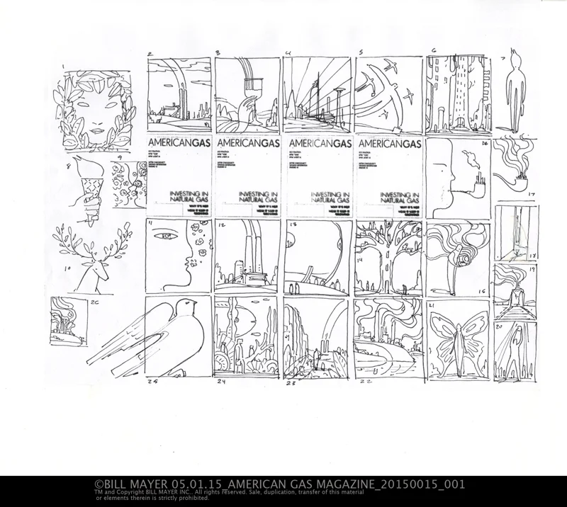
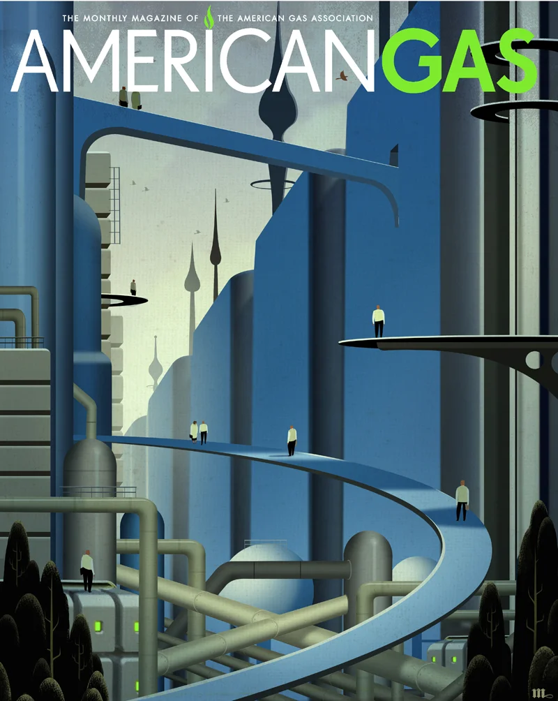
Interesting project I recently did for American Gas Magazine. Always starts with some thumbnailing...
lots of great ideas. there were a few I thought worked best so I tightened those up and sent them off.
have been playing around with some digital directions. This seemed a perfect fit.
The articles were about some interesting technologies in industry and agriculture,
They really liked the "giant tomato".and the "tomorrow land" ..... We decided to keep the cover more directed at the future technologies side, a bit more of a broad direction for the cover.
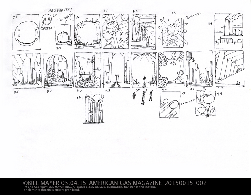
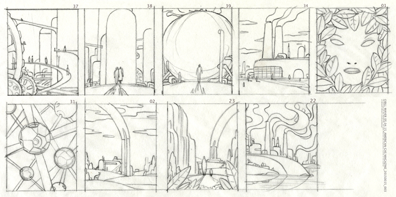
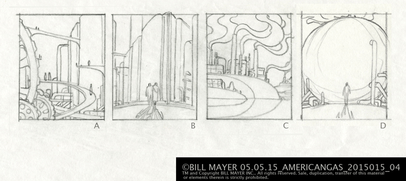
I really liked a few of these ideas and I am sure a few of them may show back up down the road. For now the winner is "Tomorrow Land."
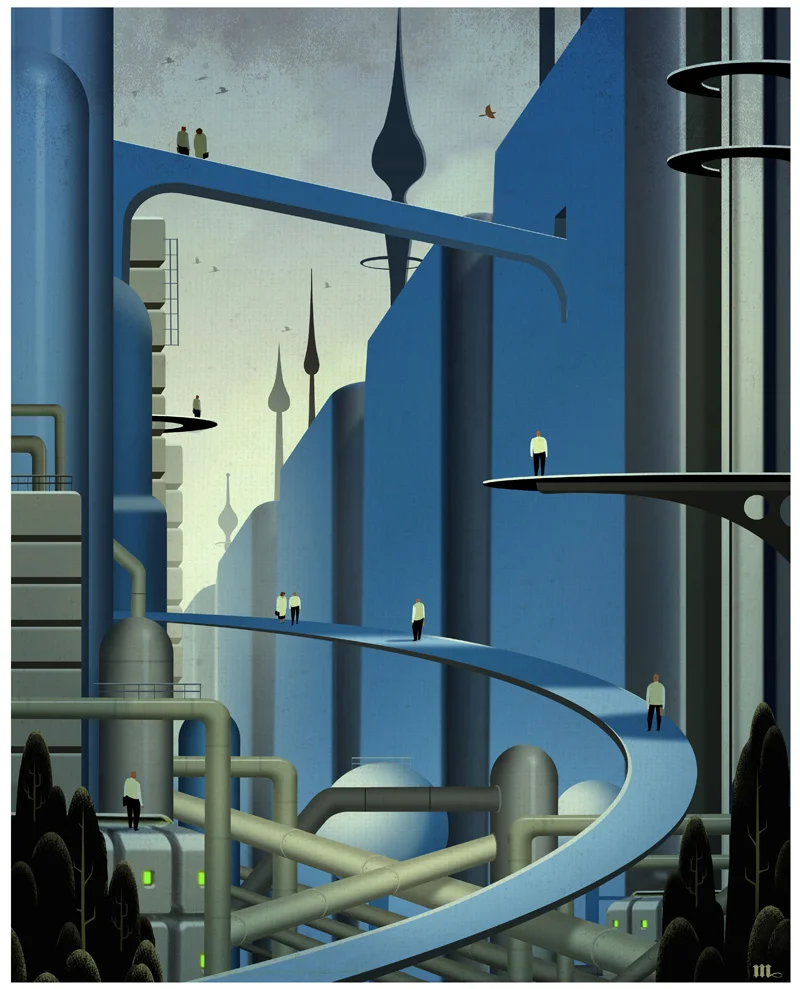
I loved those old pulps-ish covers from the Thirties and forties... My initial thought was to have old industry represented by gears with a bridge tied to the new tech of fuel cells. They didn't get this connection and wanted the gears replaced with more of the tanks and cells. Kind of a scifi look to it.
I made all the buildings made of fuel cells connected with walkways and piping.... Once i got deep into the finish it seemed just too hard so i pulled some trees and birds into the environment to soften it up a bit....They also help add some weight to the bottom.
I wanted to add spires in the back and decided that clock hands worked well conceptually and visually. There was some thought that they looked a bit to much like the Islamic towers... But no one mentioned it at the magazine.
Blue is the color for gas so the obvious choice for a color scheme.... I tried a quick hue slide and saturation to the green side but Tina liked the blue and that's where it stayed.
Big thanks to art director Tina Enck at The YGS Group for thinking about me on this project ... great fun....LInk to Magazine
