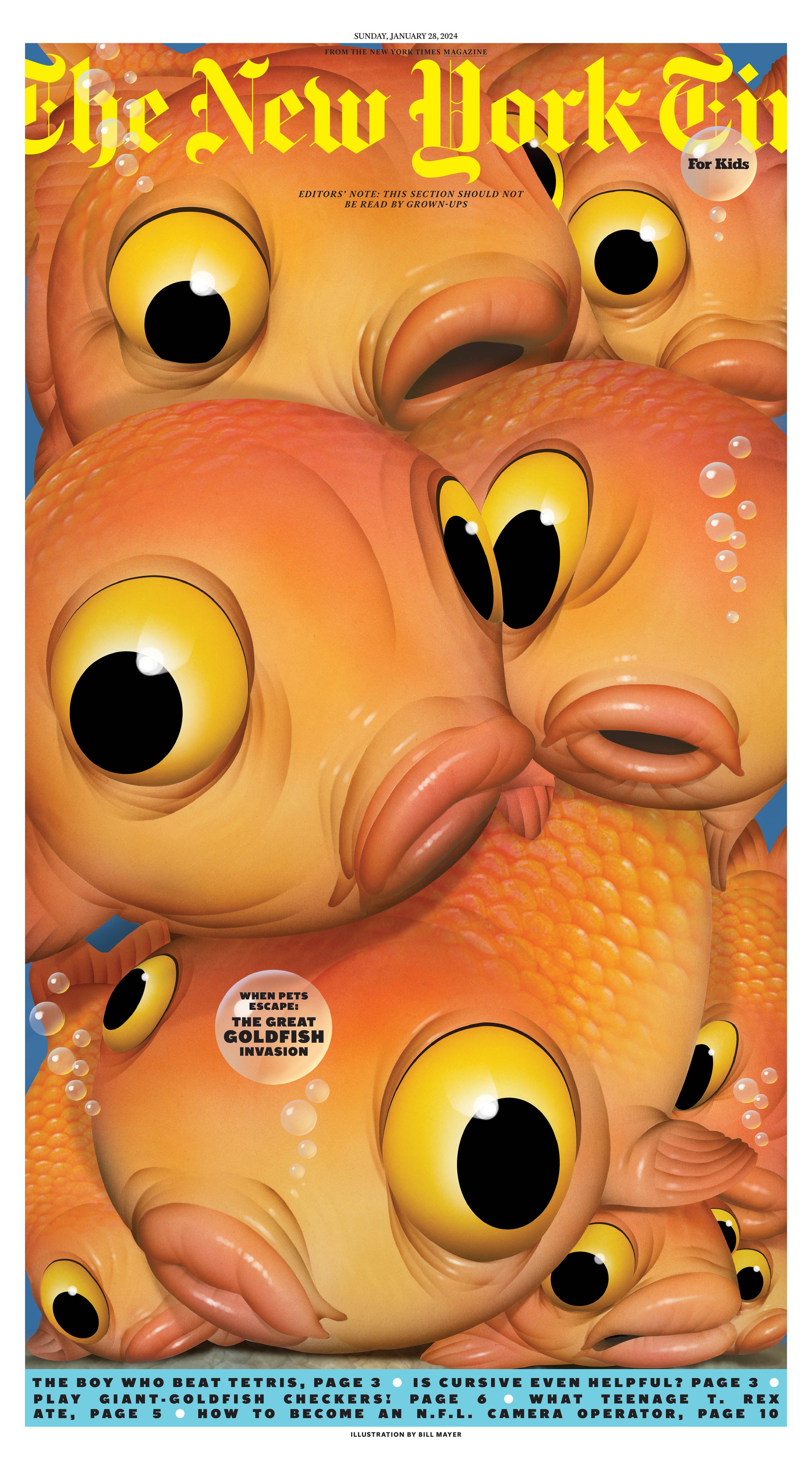
What a great way to start off the new year, with a call from Debra Bishop with another fabulous project for the “New York Times For Kids.” This one about the invasive goldfish that have been released into Lake Ontario (as well as in lakes in every state in the US except for Alaska!) The same pet goldfish that you keep in a fishbowl or an aquarium can grow huge when given the space. One caught in France was 62lbs. And they can live up to forty years!
So a cover and a spread definitely should get some attention. Deb says she's open to any direction I feel strongly about, but she really likes the wacky airbrush character illustration stuff. It's kind of fun to pull that style back out and it felt totally appropriate for the subject matter.
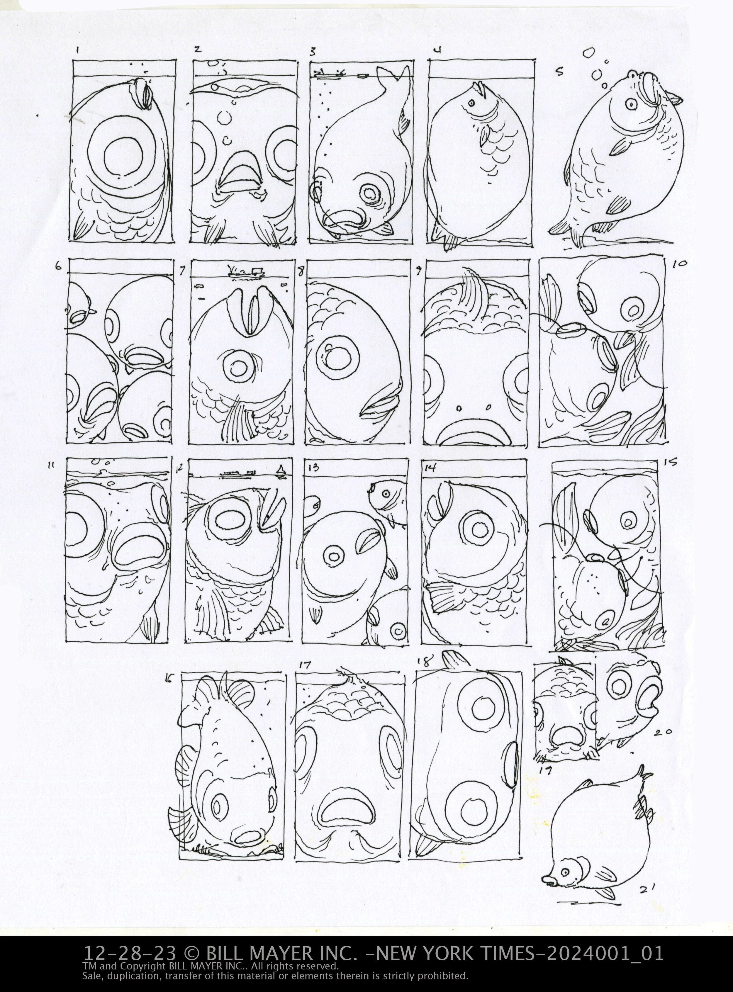
I aways start with thumbnail exploration. And of course the large size of the cover (12x22”) makes me think of a huge goldfish, so big it is crammed into the dimensions of the cover.
There were a bunch of great ideas, including a single fish crammed into the allowed space, but the group of fish fit well as it also addressed the invasive, crowded aspect.
She picks four ideas for us to tighten up and show to the editor. I rework the thumbnails into tighter sketches.
Some of my favorites 1-2-6-11. a nice grouping.
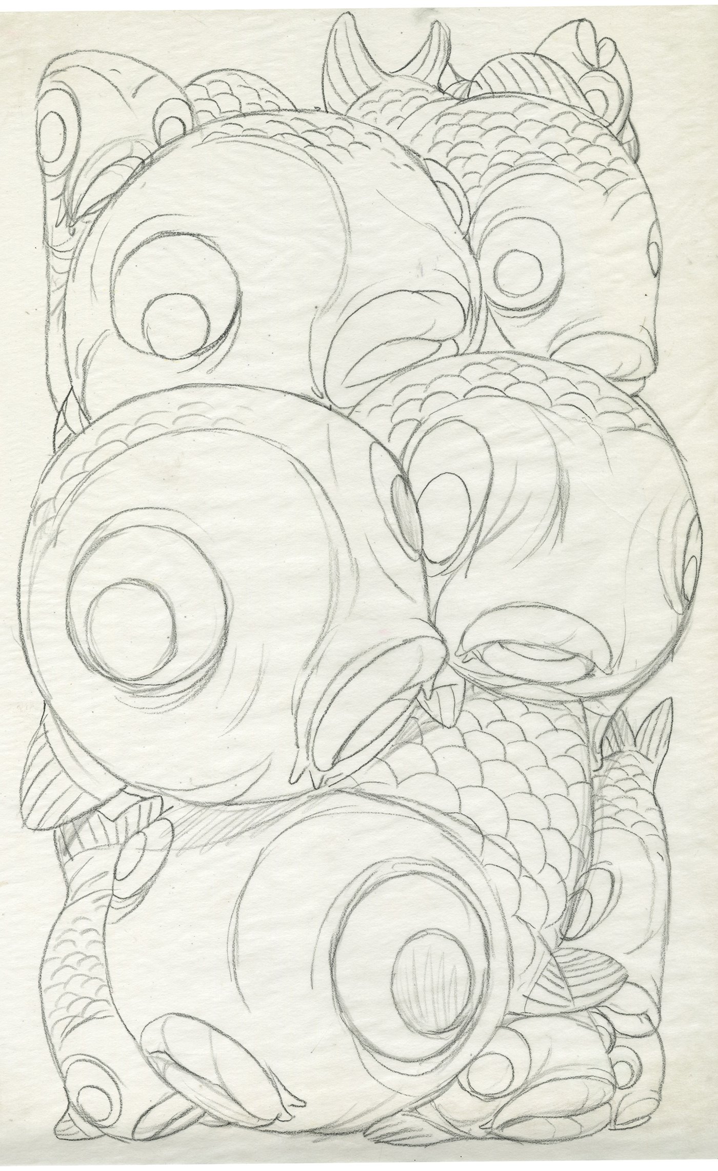
Amber and Deb like the group so it's off to one last round of tighter sketches before the final.
I filled the cover with big fish and add a few more just to make it look more crowded. The sketch looks good and we're off and running.
Unfortunately Lee is under the weather, so I escape the sick house and bury myself into work. Up at 5:00am and into the studio. A break at 8:00 to check on Lee, bring her some breakfast. This goes on for most of the week. I feel sorry for Lee on the sofa. Deb gets my full attention as I stay away from the sick house except for dropping off food and drugs.
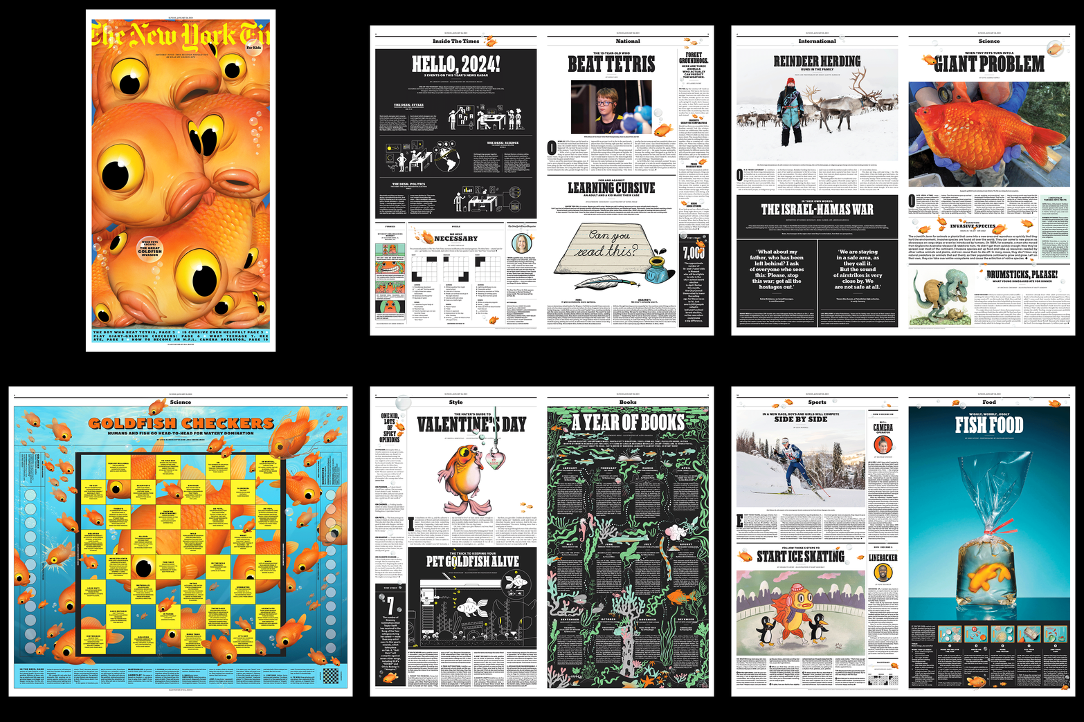
Back to the grind. Repeat at lunch and dinner. I was making good progress on the cover, so when I got the call to do an interior spread as well we are ahead of schedule and can jump right on that one as well. Another crazy, crowded illustration with tons of fish and a game board overlaying the illustration. I did an initial sketch for the board game image, and I think the only direction was “MORE FISH.” That and making some of the fish eyes look through the spaces of the game board. I did a tighter sketch and started on a background while I was waiting for approval.
The first pass on the fish goes well but needs a brighter gold color to read faster as fish. So I pump the colors more vibrant and work on making the scales more obvious. I think this works much better now... Can't wait to pull it into the layout.
There are also some small refinements to the image to make the title read better. I miss the extra fish but the cover is working now much much better. Mia is working on the game board and it's shaping up nicely. lots to work around so I do all the fish on their own layers so they can be moved around to accommodate the mounds of info and laundry lists of things to try to include in the illustration. Believe it or not her only direction is “MORE FISH.” Crazy goldfish are spawning and making babies fast as I can clone them. Copy+paste a few dozen more to fill in some areas.
Some tweaking on placement… All of it is looking great.
It is always such a pleasure working on one of these. They are such a joy to see them in print, too. When I can find them... We've had such a hard time finding a printed New York Times down here in Atlanta! Bookstores don't even carry them. Well it's getting harder and harder to find a bookstore. But I will persevere and locate one somewhere.
Big thanks to the team at The New York Times and the “For Kids” department. Debra Bishop, Amber Williams and Mia Meredith. Thank you thank you for thinking of me.
